Design > Logos
MI-Connection, our small, local cable, Internet, and voice client, needed to rebrand with a new name and logo that projected authority and reliability. Our competition were all well-known, out-of-town players: Time Warner, Dish, and Windstream – big and personality-less, it was still a no-brainer they could handle your personal and/or professional digital life. Plus, everyone already knew them.
Discovering a name that is appropriate for a business AND sounds super cool is, well, hard. What’s harder is clearing your super-cool-sounding, appropriate name with legal. Obviously, you can’t start with legal, so you have to have fun thinking of a lot of names, knowing that most of them will go straight into your trademark lawyer’s trash can. To help us spread our thinking out, I made a little graph to work to.

FINAL: Here’s where we finally ended up! I love the branding process because when the thinking is right, and the work is both responsible and good, you can’t lose no matter what logo the client chooses in the end. I had no idea we’d end up here until we suddenly did. Everyone’s input really put a lot of confidence behind the final final because everyone had ownership.

IMPORTANT GRAPH: So simple, yet pretty useful! On the far left you’ll find names like COMNET or TELEWEB. Stuff that you’ll never get legal clearance for. On the far right you’ll have names like NIMBL or ZING. Crazy names that no one would pick for a communications company. What we wanted (and where we’d end up) is to be just to the left of the “Legal Gold” line in the middle.
On the far left are names you’d expect a cable company to be called. On the far right are crazy ass names that don’t mean anything. Now, the further you get to the left, the more legal trouble you’re going to get into. Same as trying to buy a domain nowadays, it’s next to impossible because all the cool stuff is already taken by similar businesses. The more you go to the right, the more you’re clear with legal because at the far end, these words are silly or completely made-up. Tech-startups thrive in this area with all their misspellings and chicanery. We needed to be in the middle-left. We weren’t a crazy little startup. We needed weight, authority, and familiarity. We started with 300 contenders and it was (painfully) narrowed to 10 before we flung them to our amazing attorney. Three survived and after a few rounds of visual concept boards, we had a winner we felt did the job – Continuum. As we saw it, that’s where your digital life thrived – in the Continuum. We were invisibly working to keep you connected to all the extremes in your life – Work and Play, Family and Friends, Sports and News...and everything in between. The only question was, and this is terrible but true, would people be able to read it and say it? It has two “U”’s after all. So we went out and filmed local folks from the three towns reading the word off a card. They did great, the board was convinced, off we went.

COMP: Once a winning name popped out of legal (Continuum), I could get to work designing marks for it. These are from the first round of black and white ideas. Early on we thought we’d need the name to be Continuum Network, so that’s why you see the “N” in some of these. In the end we decided against it. I still like all of these except the pixelated C on the bottom row. The head of tech at Continuum said it looked like bad reception and we said, “Damn. Good point!”

COMPS: A look at some of the logotype ideas we presented. In the end we nixed this direction altogether because I was nervous about ending up with a problem we had with the old MI-Connection logo – it was so long and skinny that it needed to be really big all the time to be legible. Even thought the one on the bottom right is not as long as the rest, it’s complicated with the dots, so same problem.
Continuum’s logo had to do the same thing the name did: project strength and more than a little corporate backbone. It had to look reliable like it’s got big money behind it, but somehow a be a little, I don’t know...quirky? We presented a LOT of logo / logotype options. All in black and white at first so we could concentrate on how their form alone made us feel. Narrow it down to three and add some color for each.Then the favorite color pallet on all three logos. The three go off to legal, and one came out a winner. The C with the radiating, Wi-Fi-like bands wasn’t the most out-of-the-box idea, but man, it worked so hard doing what we needed done. Especially the familiarity part. It doesn’t take a genius to see that phone service isn’t very important to folks, cable is tanking fast, and Internet is still the future. So if you take away anything from this logo, it should be that we supply Internet. But the bands are different colors, and each color represents a service we provide. And those service icons are locked up with our logo. And eventually, after enough exposure, we’d be able to use just the C at times to communicate our brand, which will be kind of cool.

COMP: Once we decided on a short list of logos, in come the colors, along with some idea of how it would all live in the wild. A word about color – it had a job to do as well. Because the name and logo was corporate and reliable.and the messaging would push “we’re local”, we needed our color palette to be the bridge between those two things. The colors had to say, we’re respectable, but uniquely different.
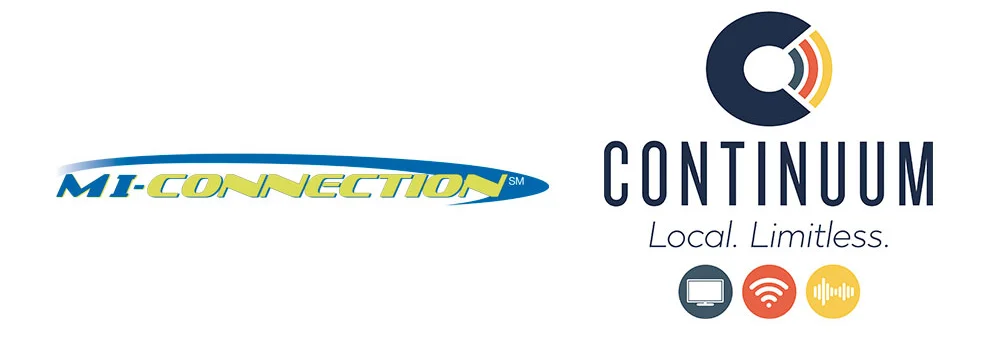
BEFORE AND AFTER: On the left is the old logo and to the right is the new brand we created, name and all. I’d had to work with the old logo for years and it was such a pain. There were no variations of it. Not even an all-white knocked out version! So everywhere we used it had to be on a super light color and it had to have LOTS of horizontal room if it was going to be big enough to be read. I was sure to design some flexibility in the new brand I created.

COMP: This is how what we now call the “service bands” could work in the future – playfully weaving in out of our ordinary lives. Quietly busy in the background keeping us connected to the things that are important to us.
I mentioned above that in the Continuum was where our digital lives flow. Through this, and the color-coded services, we got a fun little bonus idea: Why not illustrate the services we provide as bands flowing through the air around us? We explored all kinds of fun ways to use this graphic in the ads (you can see those here) and it gave us an extra bit of brand imagery that we could either pull forward or drop back in the future.

DAVE SOPP – Creative
Yep, that’s me. I’ve got over 20 years of marketing strategy, graphic design, advertising art direction, and illustration experience. Want to use some of it? Email me at dave@davesopp.com


