How to Plan for Every Little Thing.

Design > Identity

Here’s how long I’ve been in the business: rebranding projects would start with the logo and follow with the stationery. Hahahahaha! Remember stationery? No? Ahem. Well, it’s still useful. It is! Ok, what’s most useful now is your email signature, and the way your company’s bill looks, and the envelope that carries it. That’s right, the junk drawer of identity. But it’s super important! Because any of those things can be the loose thread in the sweater. Someone in billing gets the idea to pull on a thread and everything unravels. I’m not being dramatic. I’ve seen it happen. Lots.

FINAL: Yep! Paper stationery! Business cards! Envelopes! They won’t die and they aren’t going away! What was once the most important piece of communication for a company has become the graphic designers junk drawer of to-do’s. But you gotta do it be…
FINAL: This whole project had to be done as economically as possible for a lot of reasons. So a clean look worked well in more ways than I thought then we got to the fleet graphics. I worked with the wrap company to design these things for maximum g…

FINAL: This whole project had to be done as economically as possible for a lot of reasons. So a clean look worked well in more ways than I thought then we got to the fleet graphics. I worked with the wrap company to design these things for maximum gangability in printing.

That’s why we were sure to have plans for the junk drawer stuff when we rebranded Continuum. We wrapped all our rules up in a detailed book of design guidelines so that any other vendor or employee could refer to it if they got the hankering (and preferably, permission) to make some Continuum materials on their own.

Fleet and building signage are far from junk drawer material because they’re so visible, but it’s a specialized use of the new identity. Do you know what it costs to wrap a van? It’s crazy expensive! And Continuum had 60+ various vehicles that needed to be rebranded. So I teamed with the signage company they picked so I could design graphics in a way that would let the printer gang up the job, maximizing the wrap material to its fullest. It helped a LOT to have a clean, white identity, letmetellyou . It was a bear to figure out, but fun at the same time. And guess what? The less wrap material you have on a vehicle, the longer it’ll last. The vans were all stripped and detailed (to get rid of ghosting from the old brand), and redressed in their fancy new graphics. Two years on they still look as good as new.

FINAL: While the building now looks WAY better than it did, I wish the graphic service bands weren’t so boring and straight on the building. I had comps of the bands organically swirling and looping their way across the building, but everyone wanted…

FINAL: While the building now looks WAY better than it did, I wish the graphic service bands weren’t so boring and straight on the building. I had comps of the bands organically swirling and looping their way across the building, but everyone wanted to play it safe. It also made it cheaper to have it painted. Those blue marks on my mock-up up top are to show stupid town planning that we were complying with a signage code that said we could only use 20% of the buildings surface.

Continuum’s HQ (formerly MI-Connection) was always kind of a dump. Situated in a virtual hole next to a tall railroad berm, you couldn’t really see it from the main road. They’d had a tall pole with a tiny lit rectangular sign atop.  We had to ask Mooresville’s planning department to replace it with something a little taller. They said no. So we tore the sign pole down completely and turned the whole building into a sign. Fuck you, planning! We painted the whole building a bright, clean white which made it WAY more visible to traffic. And the existing architectural lighting made the thing glow like a shiny new Apple store at night. 

dave_bug.jpg

DAVE SOPP – Creative

Yep, that’s me. I’ve got over 20 years of marketing strategy, graphic design, advertising art direction, and illustration experience. Want to use some of it? Email me at dave@davesopp.com
 

How to Turn Good Work Into Great Work.

Strategy > Branding

Stop right here. If you haven’t read about all the MI-Connection drama leading up to the complete rebranding of this company, you really need to catch up. Seriously, otherwise it’s like starting House of Cards from the middle.

FINAL: We had two objectives – look reliable and be local. The name, logo, and color palette were in charge of reliability. We even got a bonus graphic from the very definition of Continuum. The three color-coded services we offered are always seen …

FINAL: We had two objectives – look reliable and be local. The name, logo, and color palette were in charge of reliability. We even got a bonus graphic from the very definition of Continuum. The three color-coded services we offered are always seen looping effortlessly behind everything we do.

Caught up? Good. The tri-town-owned cable, Internet, and phone company, MI-Connection, was now doing great. The new advertising was doing well, subscribership was up, negative public opinion had all but subsided (except the die-hard trolls. Haters gonna hate), customer service had reached an all-time quality high and really, the only thing holding the company back was its old identity and all the baggage that came with it (see here). 

BEFORE: Look, I can’t knock this too much because I was the one responsible for cleaning this act up. Take a look at what it was before, for God’s sake. I got this brand cohesive visually, then spent years driving home the super tough messaging that…

BEFORE: Look, I can’t knock this too much because I was the one responsible for cleaning this act up. Take a look at what it was before, for God’s sake. I got this brand cohesive visually, then spent years driving home the super tough messaging that this company was NOT public enemy #1. This hard work worked hard to give us the opportunity to take this company to the next level.

There was a different vibe afoot at MI-Connection and it needed to be defined. Kelly and I worked up some market research with the CMO to find out what the townsfolk REALLY thought about their community-owned communications company. I’ve never been a big fan of focus groups. I’ve been in plenty. It’s expensive and they’re so easily manipulated by whoever is running them (the company who wants positive feedback, the agency who wants the opposite or whatever, etc.). So we launched a sincere, straightforward email questionnaire campaign (nothing fancy, just a Typeform thingy) across MI-Connection’s service footprint, steeling ourselves for the prospect of most everyone either not participating or just trolling us. We were surprised (in a good way). We had an 15% response rate and while a few were ALL CAPS TYPING CRAZY PEOPLE, we got a wealth of feedback from our survey. 

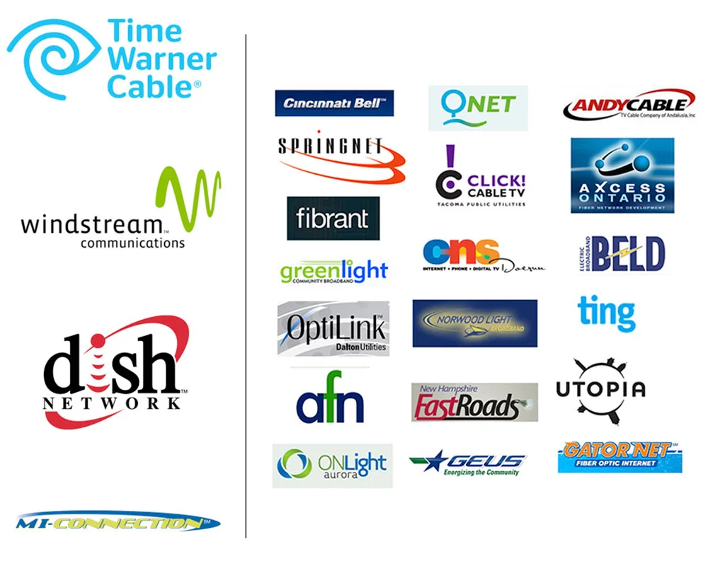
RESEARCH: Welcome to the world of shitty communication company logos. On the left, our regional competition of mostly giant out-of-town providers. And us at the bottom left there. The longest logo and therefore the smallest logo in the bunch. Does i…

RESEARCH: Welcome to the world of shitty communication company logos. On the left, our regional competition of mostly giant out-of-town providers. And us at the bottom left there. The longest logo and therefore the smallest logo in the bunch. Does it inspire faith in MI-Connection’s abilities? Nope. To the right I give you a smattering of what indie communications companies were up to across the US. Mostly a total shit storm except, in my opinion, ting and fibrant. And maybe Qnet. Clean and simple, sure, but seemingly reliable on logo design alone? Are they able to stand up against our list on the left? Dunno.

Ready for this? People didn’t care that MI-Connection was community owned. Despite the real promise that all eventual profits would be dedicated to buying more emergency services, playgrounds, etc., what people liked most was that MI-Connection was locally owned. Sure, the difference between the two is super microscopic, but it’s real. Because MI-Connection was owned by three towns, this made citizens share holders thus putting them in charge of how the company benefitted their communities. But they didn’t care about that (even though we were always super clear about it). Instead, they responded more positively to having a local alternative to the big providers, which MI-Connection was designed to be from the beginning. The other big takeaway from the survey? People also wanted to believe that their provider was capable and reliable (aka. Duh). We did extensive research into what other indies we’re doing to stand up to the big telecom companies. Turned out, not a lot.

FINAL: Is it just me, or does Continuum look more professional and reliable than Dish and Windstream? Not to be OFD (Own Favorite Designer), but doesn’t Continuum look at least competent in comparison to the other logos?

FINAL: Is it just me, or does Continuum look more professional and reliable than Dish and Windstream? Not to be OFD (Own Favorite Designer), but doesn’t Continuum look at least competent in comparison to the other logos?

Next we interviewed employees – with no management present, just Kelly and I, and them. What were they up against? What were they frustrated with? What were their ideas for big and small change? This was super valuable because when all the research was said and done, we presented more than a mere identity to the CEO. We presented a whole new company that would solve the problems we’d discovered. The CEO was on board, and as we explained to the Board of Directors, you can’t just put a new name on this thing and hope people forget what it was. To change perception, you have to change reality. They agreed, but I’ll always remember the words of encouragement the Chairman of MI-Connection’s Board gave me after that presentation. After everyone filed out of the room, he shook my hand, and smiling, said, “Don’t fuck it up”.

PROGRESS CHART: Rebranding a communications company from it’s name to an intern’s email signature can be, um, intimidating. I made this simple chart so the CEO and the board could clearly see the path from start to finish. In every one of the thousa…

PROGRESS CHART: Rebranding a communications company from it’s name to an intern’s email signature can be, um, intimidating. I made this simple chart so the CEO and the board could clearly see the path from start to finish. In every one of the thousands of presentations for each step, I’d use a marker to show where we were in the process. The far left is represents the 300+ names we’d whittle down to favorites, then to a few, then a winner. Then a ton of black and white logo ideas, color exploration, favorites, then final colors., Then we concept the materials with long lead times, while we explored fonts and taglines and stuff, and then on to advertising concepts and a final launch campaign. Everyone found this chart oddly comforting. Even me!

I built out a detailed plan of work and a timeline including the MANY presentations we’d have to make. We needed every commissioner, Mayor, Town Manager, PR folks, etc. to understand exactly why we were doing what we were doing (seriously, in the end we must have made somewhere around 35 presentations). We kicked things off with a broad naming exercise (about 300 name options), then narrowed that down to 10 to run by legal. That narrowed it down to 3 viable names that we presented on visual concept boards of how each name might be treated. Once we had a name approved, it was time to make it a logo. Remember, people want to believe their Internet provider is strong and reliable. That’s the job the name and logo had to do. A ton of more options, a dive into color palettes, and it’s all whittled down to one winner – Continuum.

BEFORE AND AFTER: Amazing how much a nice clean rebrand can improve a look, right? And it didn’t just make the fleet and the building look better. It made the people who work there feel better. Morale goes up, customer service goes up, business goes…

BEFORE AND AFTER: Amazing how much a nice clean rebrand can improve a look, right? And it didn’t just make the fleet and the building look better. It made the people who work there feel better. Morale goes up, customer service goes up, business goes up. What’s that old saying about raising all ships? That.

There was still one big job left, and that was to make our strong, reliable name look local and friendly. For that we drew inspiration from a different company altogether – Jet Blue. Yeah, the airline. Same kind of problem, really, if you think about it. Reliable, trustworthy name. Fun, un-corporate language, clever amenities and friendly customer service. Lot’s of cool, branded little programs and lots of fun, light icons. And instead of using the same old stock photos of families laughing on a couch in front of giant TV’s, we’d reflect the real, local people who are answering the phones and installing your routers. Honestly, you couldn’t do this if your employees didn’t care, and these people did. It IS the south, after all.

FINAL: We launched featuring employees in all our communications along with influential citizens from all three towns. I like to call this Guilty by Association: “If very outgoing, visible, respected people from my town are not only backing this com…

FINAL: We launched featuring employees in all our communications along with influential citizens from all three towns. I like to call this Guilty by Association: “If very outgoing, visible, respected people from my town are not only backing this company, but also publicly endorsing this company, well, it can’t be all THAT bad.” It worked. Eventually we were able to just stick to the heroes of local customer service and let them shine.

FINAL: Some of the advertising featuring the folks who made the Continuum’s promise of excellent, local customer service a reality.

FINAL: Some of the advertising featuring the folks who made the Continuum’s promise of excellent, local customer service a reality.

Finally, a tag line to wrap it all up with a bow. Kelly nailed it and I especially love hearing it at the end of every cross-channel TV spot we did, “We’re Local. We’re Limitless. We’re Continuum.” We set off a tease campaign a week early that made it look like a new provider was coming to town (more on that here), and on the big day we let the hounds loose with an education campaign for existing customers (we’re a new company now), and a proper launch to potential customers.

How did it end? Continuum ran this campaign for two years (at this writing it’s still going). In the first year they hired 6 more local customer care specialists and built out a bigger call center. In fact, it worked so well that the debt was starting to be paid down faster than anyone thought it would. Which is when they decided to sell it. Yep, they paid $80M for it and estimated they’d get $56M for it. They ended up getting $80M for it. I’d say it worked pretty well.

dave_bug.jpg

DAVE SOPP – Creative

Yep, that’s me. I’ve got over 20 years of marketing strategy, graphic design, advertising art direction, and illustration experience. Want to use some of it? Email me at dave@davesopp.com