How Honesty Isn’t Always the Best Policy.

Strategy > Sales

Before I came on board, VersaMe, makers of early education technology, had brought on an expensive big box rep group with great credentials. Turned out they sucked for lots of reasons, but they managed to arrange a phone call with a buyer form Barnes & Noble while I was in California and so I took the call with co-founder and CFO, Nicki Boyd. We did our thing and at the end, the buyer was still on the fence when she asked, “Are you going to be at ABC next week?” “Of course we are,” I said. “I’ll get you the booth number later today.” She said, “Fine, I’ll come by your booth Friday afternoon at 2 to take a closer look at the Starling.” We hung up the phone and I looked at Nicki and said, “Guess what? We’re going to the ABC show.

ABC SHOW: Mmmmmm. Vegas convention center. Soak it in.

ABC SHOW: Mmmmmm. Vegas convention center. Soak it in.

Of course we had NO plans to go to ABC. Nicki didn’t even know what it was. But I did. ABC is the huge annual, baby gear trade show in Vegas for wholesale buyers big and small. I’ve done ABC multiple times in the past for Wrybaby. Booth space typically starts at around $5,000 for the three and a half day show. That doesn’t count your airfare, lodging, and food. Nor does it include what it costs to have a decent presence there. And if your product is a high-tech baby gadget, don’t even go if you’re only going to use what they supply you for $5K, $10K, or even $15k: plain industrial carpet; two folding chairs; dark blue fire-retardant curtains as your walls; a plastic trash can; and a white plastic sign hanging from the curtains with your company name and booth number printed in Helvetica Regular. No, you’ve got to either spend $$$$ or $$ and be clever. We had to do the latter. Because this was a one off show for us. Of course we wanted to be in a big box store, but at the time we were really trying to make a connection with consumers on our own. We weren’t focused on a wholesale strategy. So it was worth the gamble to go and make our Barnes & Noble meeting, but we’d also have the chance of meeting other relevant big box buyers (Target, Buy Buy Baby, etc.). Not to mention all the indie mom and pop buyers.

ABC SHOW: Welcome to the show. Here’s what you get for all that $$$! Now to paint some lips on this pig.

ABC SHOW: Welcome to the show. Here’s what you get for all that $$$! Now to paint some lips on this pig.

This post isn’t about booth design. Because our booth ended up being the least expensive version of what it would take to pass for looking like we had advanced tech to offer, that we knew what we were doing, and that we had done shows before. All were important bars to meet for any exhibitor. OK, I’ve gone this far, so I’ll give you some quick exhibitor tips for going on the cheap. Get a pop-up display to use as your back wall and get a snazzy, eye-catching graphic wrap made for it. After 8 years of doing big shows twice a year for Wrybaby, I had never used a pop-up (I always had those spaces custom built), but for VersaMe I used monsterdisplays.com. They were affordable, fast, and the quality was great. Still, that solution alone is pretty lame. You gotta spice it up with furniture. Don’t rent tables and chairs from the show. It’s expensive and they look like shit. Find an IKEA nearby and go buy the small tables and chairs you need there. Also, if you’re going to display a product, get some shelving there, too. Oh, and some accent rugs for color. Then get an Uber and take it all to the convention center and start building. In the end you’ll have something that’s somewhat unique, eye-catching (if you bought the right stuff) and a step or two above being a basic bitch. Your booth neighbors will also not hate you.

ABC SHOW: A quick Uber to IKEA and we’re in business. A table set in company colors (YAY IKEA) for our big Barnes & Noble meeting (and whoever else we’d be talking to)!

ABC SHOW: A quick Uber to IKEA and we’re in business. A table set in company colors (YAY IKEA) for our big Barnes & Noble meeting (and whoever else we’d be talking to)!

Anyhoo, we made it there. Our lodging was an AirBnB apartment in a dingy mixed-use building behind the convention center, whose retail anchor was a psychic. The dark halls smelled strongly of heavily seasoned fried foods. It was amazing. We got our goods at IKEA, built them all night, arrived for the first morning of the show...and waited.

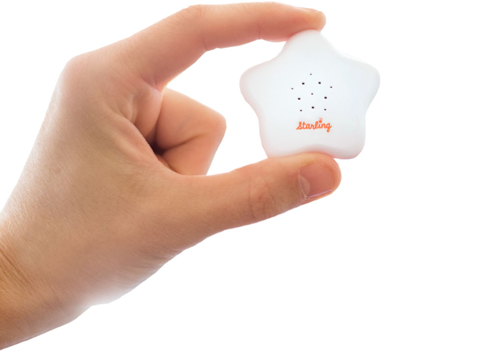
We made contact with interesting folks big and small (a lot of ABC is meeting buyers, then closing sales after the show). We also got to practice the pitch, refining it here and there for everyone who stopped (and there were a lot). Finally, the moment of truth – our Barnes and Noble buyer arrived. We went through our pitch as she stood looking looked at the display we’d set up. The Starling was out of its box perched in front of a pyramid of the packaging behind it. As I talked, I saw she was looking hard at the packaging. She asked a lot of smart questions, and then things went quiet. She was still looking at the packaging when she said, “I feel like It’s not ready yet. Let’s stay in touch.” She thanked us and she was gone. We’d taken a chance and it didn’t pay off.

ABC SHOW: Here are some very real, very terrifying things one could purchase at the ABC Show. Don’t ask me why. They were in a catalog I found near a trash can by the bathrooms. I wondered if this company also had a pending meeting with our Barnes &…

ABC SHOW: Here are some very real, very terrifying things one could purchase at the ABC Show. Don’t ask me why. They were in a catalog I found near a trash can by the bathrooms. I wondered if this company also had a pending meeting with our Barnes & Noble buyer.

After the show, I followed-up with the buyers we met. Especially our Barnes and Noble friend. I wrote that it was great to meet her and I totally understand her assessment that we weren’t ready for prime time yet. In fact, I forgot to mention to her that we’d heard that before, and we were just wrapping up a redesign of the packaging. I was getting some final mockups next week, and when I did, I’d send some photos over to her. Of course, there was no redesign underway. So now I had a week (including the weekend) to redesign the packaging. I threw myself into a full study on the project and got founder approval. I’d still heard nothing back from the buyer, so I kept cranking. I printed designs and built fake boxes, photographed them, and sent them off to the buyer. Again, I heard nothing back. For weeks. She didn’t reply to my follow-ups. I was bummed. We took another chance and that didn’t work, either.

Three weeks later I got an email out-of-the-blue from Barnes and Noble. It was a PO from their purchasing department with instructions on how to register as a vendor. They wanted 500 units for a test run in a few stores. We did it! It all worked! Except, wait, was it because of the packaging? Because it would take time to print the new sleeves for reals and get 500 existing boxes unwrapped and repackaged. I wrote to ask if they expected the new packaging. I wrote everyone – buyer, purchasing, underlings, interns. No one would get back to me. So, we shipped the order in the old packaging.

I wish this story ended with something cool, like, “They sold out in minutes and the buyer took us out for a fancy dinner and we swapped stories and laughed all night long”. But what happened is usually what happens when you’re a small business working with a behemoth. We heard nothing. As a vendor you get sales information every week. Or at least you’re supposed to. We didn’t for a really long time, so I wrote to everyone in the organization to fix it. Finally, months later, I got a spreadsheet from them and the total units on hand were incorrect, and sales were listed as none. We asked which stores they were in, and they couldn’t say. After a while, I had to turn my attentions elsewhere. About 6 months later I got an email from Barnes & Noble’s purchasing dept. They were planning a reorder, and they wanted to know if we had enough units in stock. I couldn’t believe it. I wrote back again and again, saying yes – we were ready to go. Then I got an email alerting me that there was a new buyer. So I called her to say we were so excited to supply her with more Starlings, and she said, “Oh, we have no intention of ordering more Starlings.” I never heard from them again. And that, my friends is how most big box adventures end with a 😐.

DAVE SOPP – Creative

Yep, that’s me. I’ve got over 20 years of marketing strategy, graphic design, advertising art direction, and illustration experience. Want to use some of it? Email me at dave@davesopp.com


How to Achieve Good, Fast and Cheap.

Advertising > Video

They say it’s impossible. That you can only pick two. Want it fast and cheap? Well, it’s not going to be good. You get it. I do, too, and agreed with it until I figured out how to get all three at once.

VersaMe’s Starling was an amazing little piece of technology. If you haven’t read the strategy bit behind this, then take a few minutes and go for it. You’ll get the big picture. This part’s all about the YouTube videos we launched in support of a giant AdWords buy worth tens of thousands of dollars. And I only had two weeks to concept and produce video for it.

When pitching the Starling, there’s a lot to get across. We had to describe a wearable technology for early-learning that no one had ever seen before, and then explain the problem it solved to people who didn’t know the problem existed. Before I got involved, VersaMe had signed onto an expensive Google AdWords plan where Google would assign you a personal rep who’d not only set you up with their best practices for production on every front, but also do Google-y things in the background to maximize your kill count. First, I dove into the secret sauce they gave us on video production. What you see here follows EVERY one of Google’s recommendations to the letter.

They say if you don’t have anything to say, sing it. Well, if you have too much to say, sing it and add pyrotechnics, a chorus line, and maybe a donkey. That was the idea behind these spots. The Starling’s whole existence involved explaining some pretty dry early-education research. And, as I note in the strategy part, you couldn’t really prove any kind of results, because, well, the results would be intangible. Oh, it worked, or would work, based on decades of research, but not like a vacuum that could pick up a bowling ball. You couldn’t immediately see X affect Y. And remember, even though we were spending a lot of money on placement, production had to be done on a shoestring.

This is the fun part for me. No time and no money – so what can I bring to this party to help solve the problem, be on brand, and come in on no budget? It’s such a challenge! Hahaha. Oh, also, the spots had to really make a big impact. 

FINAL: One of my illustrations in the Brain Hacking spot. They go by so fast! See more of my illustrations for these spots here.

FINAL: One of my illustrations in the Brain Hacking spot. They go by so fast! See more of my illustrations for these spots here.

WORK: My professional storyboard style and OH! Hey, look! It’s me at VersaMe actually drawing the brain hacked baby! Yes, that tie does go with that shirt.

WORK: My professional storyboard style and OH! Hey, look! It’s me at VersaMe actually drawing the brain hacked baby! Yes, that tie does go with that shirt.

Luckily, I’s cans draws. In various styles, too. So I put together a kinetic, breathless campaign for the Starling that a talented After Effects editor I knew (Peter Baker with sound assistance from his partner Anthony Proctor) could hopefully put together quick. I boarded out the spots, then illustrated or scrounged up all the elements and laid them out in a super-detailed, layered Photoshop Tiff. The “animation” I illustrated frame by frame, and I included them as layers for Peter, too. My copywriting wife had the perfect voice for this, so we recorded her VO in a sound studio in Charlotte (Hi, Ground Crew!). Peter would get the VO and Tiff file and apply his After Effects wizardry. Then we’d make some adjustments, and send it off to Anthony for SFX additions and final mixing. In the end, each of these spots cost about $1,250 to produce.

Between following Google’s best practices, the frenetic pacing and the fun visuals, the view-through rates for this campaign were off the charts. After so many years in the business I’ve become more than a little cynical regarding praise from people who you’re paying tens of thousands to. Right? But our Google rep was legit blown away to the point where I didn’t think she thought these would do well at all! Of course we didn’t stop there. We started running these spots on every other platform, too. We also tried some tamer material too, but later on. It was more traditional tech/baby stuff that was soft and fuzzy and important sounding. The analytics on that weren’t as amazeballs in comparison to the fun stuff, which kind of surprised me. Oh, why don’t I also show you the stuff we did with social influencer and legit funny guy, DudeDad. He made some of his own videos, and you can see how someone else explains the Starling to parents.

DAVE SOPP – Creative

Yep, that’s me. I’ve got over 20 years of marketing strategy, graphic design, advertising art direction, and illustration experience. Want to use some of it? Email me at dave@davesopp.com


How to Make the Complicated Simple.

Design > Brochures

Every client is different, and every marketing problem is different. But sometimes (although rarely) you don’t have to reinvent the wheel all over again. If something works, heck, keep it! I already had a brochure-making system that worked and I already made a bookshure (I really need a better name) for VersaMe’s Starling Partners program. It was a cool idea that worked great, so we kept all the physical formatting (same size, dimensions, heavy cover and nice page weight) for the next project. Besides, if you have to do multiple brochures for a company, you might as well build a library that looks uniform and tight when they’re all together.

FINAL: The name and logo I created for VersaMe’s platform came directly from how it worked. Also, Spoke’s not a bad name for a company that’s all about verbal communication, right?

FINAL: The name and logo I created for VersaMe’s platform came directly from how it worked. Also, Spoke’s not a bad name for a company that’s all about verbal communication, right?

The Starling was VersaMe’s early-education wearable. You can read all the deets here, but in short, The Starling was based on a super advanced platform that VersaMe created called Spoke ( I named it that based on the eventual infographics). The Starling logged data about an infant’s early-developmental progress and sent it to Spoke. Spoke would process that data and send it (along with recommended action items) to the parent and any parent-approved care givers. For consumers, the data usually just went to parents, grandparents or a nanny. But if parents wanted, they might also include their pediatrician. If an infant is a little short on direct verbal communication, their parents and the pediatrician would recognize that and, at the regular visit, they could figure out ways to improve that outcome together. Think of it like an educational thermometer that parents could share with their pediatrician.

d_spoke_brochure_02.jpg
d_spoke_brochure_03.jpg

Anyway, that’s it’s simplest version of how VersaMe’s Spoke platform works. Spoke was developed to sustain the maximum amount of early development team building. Unlike so many of today’s algorithms, this one wasn’t built to exploit user data to deliver relevant advertising. Spoke was built to deliver relevant, actionable educational opportunities to a team of caregivers in the development network the parents created, in order to meet their child’s specific needs. Cool, right? And that’s what this brochure had to explain to an audience that wouldn’t want to get into the coding weeds about exactly how that was even possible. Investors, partners, etc. just wanted to know the basics of how Spoke worked and what its potential was. 

And I made up everything you just read. Sort of. Mostly. Look, although Spoke’s functionality was clear for the founders and developers (so they could build it), no one ever really defined it in a way regular people would understand. Even though I’d made a name for myself making complex stuff simple, I was lucky to have the capable help of VersaMe’s Product Manager, Susan Tahir. Together we defined, named, branded, iconically mapped, invented creative uses for, and I can safely say, improved the complicated process that made this Spoke so valuable.

So for the brochure (and this didn’t have to be a brochook): same company; different audience; different product; slightly different look. This had to convey all the existing brand attributes, but send a different message – we were confident, smart, sophisticated, and had created a (truly) amazing platform.

INFOGRAPHICS: I really enjoyed designing the graphics showing how Spoke worked for different users. It’s was crazy complicated and I got it boiled down to an easy-to-follow, step by step guide.

INFOGRAPHICS: I really enjoyed designing the graphics showing how Spoke worked for different users. It’s was crazy complicated and I got it boiled down to an easy-to-follow, step by step guide.

d_spoke_brochure_06.jpg
d_spoke_brochure_07.jpg

I kept with my favorite system of solving one problem per spread, but this was so targeted, that I didn’t need to go overboard on the eye-candy and repetition. Here’s how this one broke down:

Cover: Sexy and High-Tech.

Spread 1: What we’re doing is a big fucking deal

Spread 2: Look, here’s why it’s amazing for everyone...

Spread 3: ...and here’s how it changes everything

Spread 4: Here’s exactly how it could be used to do this...

Spread 5: ...and this

Spread 6: You’re already behind in this emerging, proven technology

And we’re out. If you’ve seen the other VersaMe stuffs I did (the Partner Brochure, or the videos, or even the packaging) this a similar example of taking existing materials and jerking the message into new territory without having to recreate everything.

dave_bug.jpg

DAVE SOPP – Creative

Yep, that’s me. I’ve got over 20 years of marketing strategy, graphic design, advertising art direction, and illustration experience. Want to use some of it? Email me at dave@davesopp.com


How to Not Make a Brochure a Brochure.

Design > Brochures

I was recently in a meeting with a CEO who was newly hired by a long time client (not VersaMe). He didn’t have the history on what lousy shape the marketing had been in before I started helping to pull it together. He mentioned his desire to increase B2B sales and I told him we’d recently finished a brochure for just that purpose. The CMO handed it over to him, and he leaned back and flipped through the brochure for nearly 2 seconds before he tossed it on his desk and said, “Well, this is table stakes.”

FINAL: The cover of the brochure that wasn’t really a brochure. Or was it? < Insert evil laugh here >

FINAL: The cover of the brochure that wasn’t really a brochure. Or was it? < Insert evil laugh here >

FINAL: Probably the most important spread in the brochook. Publishing information! So important-looking! :-)

FINAL: Probably the most important spread in the brochook. Publishing information! So important-looking! :-)

I bring this up, not because it was kind of a shitty thing to do and say, but because it says a lot about what a brochure has to do. First, let me say that about a month before his arrival at the company, an old brochure (from before my time) existed. It was missing the logo on the cover. Actually it wasn’t missing, but the logo was the printed in the same color as its background color. So the tag line was visible in white and you could juuuussst barely see the logo if the light was shining on it just right. That CEO was actually lucky to even have table stakes to look at. Hahaha. But to my point – even though he didn’t look at the thing from the perspective of the reader it was designed for, which you should ALWAYS do no matter what C-level you are, he DID give just about the right amount of attention to it.

No one wants to read your brochure. Sorry, they don’t and they won’t. Not all of it, at least. That’s why you’d actually laugh out loud if you read all of a brochure I’ve designed and written. Look, every spread has got to solve one problem. Not page, SPREAD. But you can’t do it all at once, like in one big piece of copy. You’ve gotta boil down the point you want to make to its shortest, most effective form, and then repeat it on the same spread in different forms - pull quotes, diagrams, testimonials, icons, photos, captions. So that no matter what catches their eye as they flip through like that CEO did, something important will stick with them whether they like it or not (or even know it, or not).

FINAL: The first real spread is all about authority. This book is factual and the information comes from big places and important professionals.

FINAL: The first real spread is all about authority. This book is factual and the information comes from big places and important professionals.

All this being said, at VersaMe, we created a really quality piece as a leave-behind/mailer for our new Starling Partners Program. Our audience was libraries, pediatricians, speech language pathologists, pre-schools (public and private), teachers, and non-profit organizations. These people, who already knew the importance of early-education, were seeking out emerging technology that could: help their missions; keep them relevant; and in some cases, keep them well funded. This brochure assignment turned out to be my favorite ever because I decided I wasn’t going to make a brochure at all. Instead, I wrote a BOOK about the problems the reader faced. And midway (SPOILER ALERT), the Starling would appear as a fantastic example of what was available to solve those problems.

Because VersaMe were experts on early-education (true), and what we had to say in here was important (also true), we had to make this brochure (bookchure? brochook?) look important. That’s why I wrote it in a sort of third-persony way and even added publishing info to the title page (sometimes it’s the littlest things that do the most work for you).

FINAL: Second spread is empathetic. We know your struggle is real.

FINAL: Second spread is empathetic. We know your struggle is real.

FINAL: AH! Third spread and we final get to the Starling. But still talking about it as if we had nothing to do with it until the second sentence of the copy.

FINAL: AH! Third spread and we final get to the Starling. But still talking about it as if we had nothing to do with it until the second sentence of the copy.

As a side-note, VersaMe had always wrestled with a minor identity crisis. They had only one SKU, the Starling, so did they really need the VersaMe name? Was it confusing? Should they just call the company Starling? It didn’t make since to have an umbrella company until you’ve got more kids to put under the umbrella. Still, always plan for success. Who knows when those new products would come (turns out not very long, after all). So in this case, using VersaMe as the author and publisher of this book, and Starling as the example solution late in the story, actually helped define the company/product name hierarchy for us. And it was just good theater.

Anyway, here’s how I broke down the spreads before designing it:

Cover: Looks like a book from a research company. I see someone who looks like me and what’s that cool star thing?

Spread 1: This information we’re giving you is as legit as these researchers, respected people, and institutions.

Spread 2: Your job is super hard, we get it.

Spread 3: There’s a thing called the Starling that will seem like a miracle to you.

Spread 4: The data you could get from something like the Starling could finally prove what you do is effective.

Spread 5: Organizations are already using this Starling thing.

Spread 6: Something as helpful as the Starling is easy to set up.

Spread 7: Look at these smart smarties who are helping your peers.

Spread 8: This is all it takes to solve your problem. Not scary or complicated at all.

FINAL: Reading left to right, spreads 4-8

FINAL: Reading left to right, spreads 4-8

And there you go. I mentioned above that no one wants to read a brochure. But people like reading books. Even thin-ish, square paperback books that give the right reader true, helpful information that they’re interested in, delivered in a way that welcomes them to learn about a very real solution to the problems they have while trying to help their communities to raise their children right.

Remember that dismissive CEO from before? It wasn’t two minutes after he tossed my brochure on the table before he snapped it back up and flipped straight to the spread touting  friendly, knowledgeable professionals. Pointing to the feature photo of his IT Manager, he asked, “How’d you get him to smile? I’ve never seen a head of IT look that happy.”

Boom.

DAVE SOPP – Creative

Yep, that’s me. I’ve got over 20 years of marketing strategy, graphic design, advertising art direction, and illustration experience. Want to use some of it? Email me at dave@davesopp.com


How to Market a Product No One’s Seen Before That Solves a Problem No One Knows About.

Strategy > Branding

OMG the world needs this early-development technology. I’m dead serious. But even though this revolutionary wearable looks simple, how it works is actually pretty complicated. And did I mention the results aren’t immediate? (Just wait, I’ll get there). But one thing is absolutely clear – the result of using this technology means your child will get a substantial educational head-start over his or her peers. That head-start begins in infancy, and keeps distancing your child ahead of others for life.

PRODUCT: This is the Starling. So tiny, so cute, so powerful.

PRODUCT: This is the Starling. So tiny, so cute, so powerful.

FINAL: One of the first things I made at Versame – a 6”x9” two-sided handout for parents touting the Starling’s benefits.

FINAL: One of the first things I made at Versame – a 6”x9” two-sided handout for parents touting the Starling’s benefits.

The great advantage of doing what I do at this point in my career is being able to choose the projects I work on, and the people I work with. I really liked the people at VersaMe before I even knew about the product. Chris and Jon, two of the company’s founders, contacted Kelly and I out of the blue. They had left Silicon Valley like we did, and now lived just a couple of towns down the I77, in Huntersville. They explained that they were fans of our parenting board book, Safe Baby Handling Tips. In fact, the bit about Playing with Baby was one of the early slides in their investor pitch for a startup they were launching with a third partner, Nicki “The Money” Boyd (the nickname I gave her). Nicki controlled the finances and managed the development team back in Redwood City, while the rest of the team worked out here in NC.

BEFORE AND AFTER: The original packaging on the left didn’t communicate the product or it’s value. My redesign on the right led with the value proposition and steadily unfolded the whole story in easy-to-digest snippets.

BEFORE AND AFTER: The original packaging on the left didn’t communicate the product or it’s value. My redesign on the right led with the value proposition and steadily unfolded the whole story in easy-to-digest snippets.

Kelly and I met Jon and Chris for coffee and they explained what they were making. They had a passion for early education and learning (it ran in their family). They knew that the education system was not only broken, but historically broken and getting worse. From studying years of scientific research they concluded the only way to nip the problem was, literally, in the bud. They sought to jump-start the learning process as early (and as correctly) as possible. This was the problem they worked on at Stanford and they already went through a successful round of funding. The hardware and development infrastructure was built, and they were about to launch on Kickstarter. The three had a lot of the planning done (and it was good) but they asked us on to help them out with tightening up the branding and early messaging. That’s when we learned all about the Starling.

The Starling was a beautifully designed, high-tech wearable for children 0-4 years old. When you clipped it to your child’s clothes, the Starling would count every word spoken to your baby throughout the day. It did this in virtual real-time, without recording, and sent the data to your phone with beautiful graphics telling you how many words your child heard that hour, that day, that month, that year. It let you set word count goals to challenge you every day. Anticipating how hard it can be to carry on a one-sided conversation (Chris and Jon were also parents), the app gave you fun daily prompts to help you keep talking to your baby at every occasion - in the car, during your afternoon run with the jog stroller, at bedtime, etc. Feeling competitive? There was even a leader board that you could use to see how much quality engagement you gave your child compared to other Starling parents. Amazing, right?

I bet I can guess what you’re thinking right now. “Why?”

Why all this technology to talk to a newborn? It’s not like I’m NOT going to say anything to my baby, so why all the extreme fuss? You’re not wrong to think that. But here’s a big fact – the more words you say to a child from 0-4 years old, the more likely they are to reach their full potential. And the “to” is super important. You can’t just talk “at” your child, like over your shoulder while you’re doing the dishes. No, doing that doesn’t work the same way. Think reading, with the child on your lap. Or telling a story while making lots of eye contact. There you go, that’s the right stuff. It’s about engagement. Feed a child’s brain enough words like this and soon you’ll find yourself with an early talker. Then while other babies are still learning to talk, yours is busy learning to read. Get it? And while other people’s kids are learning to read picture books, yours is reading chapter books. This goes on for their whole life!

FINAL: For professionals who already understood the importance of verbal communication, I created this “bookshure” to introduce them to a powerful new tool – the Starling.

FINAL: For professionals who already understood the importance of verbal communication, I created this “bookshure” to introduce them to a powerful new tool – the Starling.

But understand this – doing all this talking with engagement doesn’t mean every child can grow up to be Einstein. It’s all about maximizing your child’s genetic (not economic) potential. If it’s only within a child’s genetic capacity to be average smart, they’ll get there faster and stay there for life. This can make a huge difference to a child’s quality of life, considering where they could end up without the benefit of this help. And I can’t stress this enough – I’m talking about  ALL children. Not just poor children. Or special needs children. ALL CHILDREN. (If you’re a parent reading this, please note your feelings right now. I’ll get to them later). 

Finally, dear reader, here lies the rub. Look how long it took me to explain the Starling to you and the problem it solves. My expertise in working with clients in San Francisco was taking really complicated concepts and making them dead simple for a consumer (best example here). I worked on the Starling for two years and what you read above is the shortest I think I’ve ever gotten the complete pitch. So as a marketer, here are your options:

  1. Explain how The Starling works, and then explain why it solves an early-education problem you didn’t know existed

  2. Explain how you need to talk to your baby as much as possible from 0-4 years old, and then explain what the Starling is and how it could help you do that

You can’t do one (explain the Starling) without the other (how early development works). 

The three founders had become early-childhood experts, for real. And their research scientist, librarian, pediatrician, speech language pathologist, mentors and partners were all in touch on the regular, keeping tabs on the Starling’s progress and correcting messaging when necessary so that everything stayed absolutely factual. We needed to look like experts, but not scientists. The messaging had to be intriguing, inviting and fun – but not misleading or fantastical.

FINAL: A one-sheet for interested schools to get a little more detail on how the Starling can help their mission.

FINAL: A one-sheet for interested schools to get a little more detail on how the Starling can help their mission.

The Kickstarter launch was a success in that it did what we needed – raise as much awareness as cash. (As I said, VersaMe was already funded by an investment group). Our mailing list blossomed. Sales started coming in. But that’s when the real work began.

I’ve worked on big tech in San Francisco. A lot. Sun Microsystems, Borland, Sybase, Veritas, Dell, Adobe, blah blah blah. That’s not including all the dot coms. I was there for the first big boom, and the first big bust, working freelance for almost every agency in the City. Startups are different. It’s EXACTLY like in the show “Silicon Valley” (the first season, anyway). It’s crazy and confusing and exciting and hilarious and scary and frustrating and fun as hell. You’ll NEVER pack more work into a shorter span of time than when you work for a startup. Because even though we were focused on who we were, and which audience we were talking to, we were saying it all - in every conceivable way. And we had practically no budget to do it with. Even though there was $10M in seed money, you gotta watch like a hawk how you spend it (right, Nicki?). Because it’s only going to last so long. So we were begging, borrowing, and stealing while testing the messaging multiple time a day, every day, everywhere. And once we saw progress in any direction we’d run after it full speed.

There’s no way I can ever tell you everything we did. It was so much! But one of the first things  was to use everything that inspired the creation of the Starling to build a giant online resource center for new parents, filled with published studies that prove the benefits of direct, verbal communication. Then we published articles and how-to’s on our blog everyday giving tips on how (and why) to maximize your baby-talking skills. Our newsletters were going out weekly to new parents, filled with communication tips and info on developmental milestones. I found out that the founders had invested in a HUGE AdWords ad buy that included a lot of YouTube videos. I had two weeks to deliver finished product and there was nothing in the works. We set up tents in shopping malls and Nicki and I did the ABC show in Vegas (to have a meeting with Barnes & Noble, who said no, then inexplicably sent us a huge order two weeks later). We got into a hipster tech showroom in Silicon Valley. I totally redesigned the packaging. I made an online school for new parents. We developed a custom Reading App that you could use with the Starling. We hired influencers on social media. We created a mobile app game based on the Starling. We brought on a respected social media agency to give it a go. We. Tried. Everything.

WORK: And lots of it! This is probably about 2% of the things we did to position, explain, and sell the Starling. Clockwise from top left: Dumbing it down, we created multitudes of info-loaded landing online campaigns and landing pages, we created a…

WORK: And lots of it! This is probably about 2% of the things we did to position, explain, and sell the Starling. Clockwise from top left: Dumbing it down, we created multitudes of info-loaded landing online campaigns and landing pages, we created and ran an online school, we sent the founders to present at indie book stores, parenting groups, schools and libraries. I made a Starling Honors program for little students, we made an educational mobile game, we tried multitudes of simple online campaigns and landing pages, we gave away free information (so much free information), we changed the whole website, we started marketing the platform the Starling was built on, and we developed ridiculously complex email newsletters and campaigns.

Nothing worked. At least, not on the level we wanted it to. It was just too much for people to wrap their heads around. Most thought it was a great product...for terrible parents. And of course, THEY were all excellent parents. There’s actually a study that exists which found 90% of parents thought they were parenting in the 5th percentile of awesome parents. Which, of course, is mathematically impossible. So we pivoted to focus on Starling Partnersschools (public and private), libraries, speech pathologists, pediatrician clinics, non-profit organizations. Frankly, any group that already understood the importance of early learning. Most ended up being too outright dysfunctional, painfully slow to act, or too strapped for funds to make a difference to our bottom line. Our biggest success came from developing a program for libraries to loan Starlings out to patrons. We got ourselves into a lot of libraries but not enough, and not fast enough. In the end we had to stop. There was nothing left to try. This amazing technology is now in the hands of the scientific researchers who inspired it. They’re using it to further understand how we can make our children better, smarter, happier people. I’m 100,000% sure that someday you’ll see this product (or something like it) make a huge consumer splash in the future. Sometimes a good idea doesn’t make it simply because of something that no one can foresee or control  – timing.

DAVE SOPP – Creative

Yep, that’s me. I’ve got over 20 years of marketing strategy, graphic design, advertising art direction, and illustration experience. Want to use some of it? Email me at dave@davesopp.com


How to Make the Best of What You’re Given.

Advertising > Print

I’d worked with this client for more than 8 years, and I’m still not sure where this brand originally came from. No one wants to take ownership of it, and you can guess why. It was a bear to deal with. If you read the strategy involved in this, you know all the baggage that came with it. So to be clear up front – not my logo, not my fonts, not my colors.

FINAL: The ads were clean, crisp, and clear. A total about-face from what existed before. And a HUGE step in making this communications company look like they knew what they were doing. And we didn’t have to spend a dime on photos, new logos, new co…

FINAL: The ads were clean, crisp, and clear. A total about-face from what existed before. And a HUGE step in making this communications company look like they knew what they were doing. And we didn’t have to spend a dime on photos, new logos, new colors, or nuthin’.

The first thing to do when life gives you a dog’s breakfast of a brand that you can’t change is to make the best of it. Look, it may be terrible, but it’s what they had and what people knew, so I took a deep breath and got to molding it to our purpose. I started by ejecting all the communication company visual cliches because everyone knew MI-Connection was a cable, Internet, and phone provider. Why punish the people further with stock photos of perfect families laughing at their laptops and plasma TVs? The images were a waste of time, money, and an excellent way to blend in with everything else in the recycling bin. Besides, junk like that is only useful as a last refuge when you don’t have any kind of story to tell. Think about that when you get your next Spectrum mailer.

We, on the other hand, had a really good story to tell. This is rare, so we took full advantage. Because we were the community-owned little underdog, we could say things the big out-of-town players couldn’t. And say them we did – in a way they couldn’t. We were free to launch all the broadsides we wanted at the competition because they were too big to bother fighting little ol’ us. It was so fun writing these things. And boy, did it get attention. After all, what the heck kind of communications company does ads like this!?

BEFORE: See? A little taste of what I had to work with coming on to the business.

BEFORE: See? A little taste of what I had to work with coming on to the business.

FINAL: More ads from the launch along with some online stuff we did that was really fun. Super click-baity and led to a landing page that answered the mystery and called for a sale.

FINAL: More ads from the launch along with some online stuff we did that was really fun. Super click-baity and led to a landing page that answered the mystery and called for a sale.

FINAL: The best part about this is saying things that only a local provider could say. Mr. Burnett was a real guy (actually my neighbor) and he (and all his friends) were blown away that his personal grievance would be publicly addressed in all the …

FINAL: The best part about this is saying things that only a local provider could say. Mr. Burnett was a real guy (actually my neighbor) and he (and all his friends) were blown away that his personal grievance would be publicly addressed in all the newspapers. It was so freeing to be able to do stuff like that and have it work!

I gotta admit that at first I insisted on doing the whole brand re-launch for MI-Connection with just the headline, copy and logo. No offer. Hey, I’m an art director and that’s what we do. But the CMO talked me down to reality. And she was right – it was a retail business. So I redesigned how the offer was laid out so that it played a supporting role to the brand messaging. Both are given virtually equal weight depending on what the reader is drawn to – message or price. In the end I was so happy with it, that I kept that format when we did the big rebranding later on.

I think my favorite thing about this project is that we didn’t have to do a lot of heavy lifting to stand out in a big way. In fact, we stripped everything down so far that the ads were even cheaper to produce, which let us do even more messaging. All while making a huge impact.

DAVE SOPP – Creative

Yep, that’s me. I’ve got over 20 years of marketing strategy, graphic design, advertising art direction, and illustration experience. Want to use some of it? Email me at dave@davesopp.com


How to Turn a Total Shit Show Into a Winner.

Strategy > Branding

Despite the title, this is the funnest (I know, but I made it a word) project I’ve ever worked on. A lot of what makes marketing great (and great marketing) is what happens behind the scenes. Like, how did we involve the client, the CEO, the employees in the process? Or, what obstacles did we have to overcome aside from winning the business? So read on and tell me...what was there not to love about this project from the outset? 

FINAL: The first salvo in a campaign designed to convince people to love the communications company they loved to hate.

FINAL: The first salvo in a campaign designed to convince people to love the communications company they loved to hate.

Three town governments in North Carolina overpaid, substantially ($80,000,000), for a local communications company that was failing in every aspect of the word. The public didn’t get to vote on the action (which they surely would not have done). Nope, the town officials just decided to buy it with taxpayer bonds, and did it. The result was an incredibly bitter, prolonged public comeuppance. The public rallied behind “The government shouldn’t own a communications company!” and before long almost everyone in office was out, out, out. Everyone was replaced by angry electeds who agreed with the angry public that this cable company was bad, bad news. They all wanted out of the deal, but the damage had already been done. They were stuck with a financial burden they couldn’t get out of. That thing was called MI-Connection, with the MI being a lame combination of Mecklenburg and Iredell county initials that nobody, even to this day, can agree on how to pronounce – MY Connection or EM - EYE Connection? Oh, and even if you knew the initials, good luck finding the hyphenated URL. Sad Face Emoji.

But, incredibly, it was kind of an understandable decision to buy the thing. I mean, it’s not like it was done on a whim. Despite the three towns being about 10-20 minutes north of the banking explosion called Charlotte, and populating themselves at an extremely rapid pace, this area was severely under serviced. Heck, if Mooresville, Davidson, and Cornelius didn’t lay fiber and string cable themselves, no one else was motivated to do it. Even though there were three competitors in the market (Windstream, Time Warner, and Dish), these big out-of-town corporations just weren’t investing in this area. Honestly, why should they? So how else could a town (or three) attract residents and businesses so they can grow if they could offer Internet? Before they were (mostly) drummed out of office, the commissioners did one smart thing – they found someone with big telecom experience who could turn the ship around (provided he could stop it from burning even closer to the waterline).

BEFORE: What MI-Connection was putting out there before we cleaned up their act.

BEFORE: What MI-Connection was putting out there before we cleaned up their act.

In stepped David Auger, CEO. David had incredible experience in telecom, was an ex-Time Warner executive, a marketing aficionado and a lovely man. Sharp as a tack, too. He had MI-Connection lay low for a year, advertising little, assessing the damage, and building a sharp, experienced Board of Directors. Now, here was his (and the town’s, after all they were the owners) core dilemma:

If no one subscribed to MI-Connection’s services (Video, Internet, and Phone), then the whole thing would collapse. So how do you make people love the communications company they LOVE to hate? 

My first meeting about MI-Connection was actually with the newly elected Mayor of Mooresville, Miles Atkins. The Town of Mooresville (TOM) was the biggest investor of the three in MI-Connection and Mr. Atkins was the one official who, as commissioner, was a lone voice against buying the business. For a whole year since the purchase, both the press and citizens scorched MI-Connection as an $80,000,000 socialist pariah. But Mayor Atkins had a different perspective. While he opposed the purchase, he could see that we were all stuck with it, no matter what. And by not using it to its fullest advantage, our three towns would not only be shooting themselves in the face, but also lose out on what owning a local communications company could mean to our communities. To his thinking (and it was smart), we all owned this thing – so let’s make the most of it. Mayor Atkins set up a meeting with David Auger and he gave us his perspective. In the year he’d been restructuring, there was actually good news. Lots of it. Mr. Auger was able to shore up the company and even quietly implement some programs to aid the communities who owned the company – free services to non-profits who helped local underprivileged families, free Wi-Fi for underprivileged local students, and more. Also, subscribership was up. The cable company everyone thought was a failure had begun to do better. Way better.

FINAL: We didn’t have to play by any rules but our own. So to convince people our story was worth hearing, we opened up a conversation via all outlets. The website got cleaned up, the ads were bold and in-your face, but communicating SO much better.…

FINAL: We didn’t have to play by any rules but our own. So to convince people our story was worth hearing, we opened up a conversation via all outlets. The website got cleaned up, the ads were bold and in-your face, but communicating SO much better. I devised a template for the direct mail, too. Way more professional using nothing but what was there all along.

FINAL: Some more print and some online that was really fun to write. SUPER click-baity and led you to a landing page that would clear things up pretty quick (and encourage a phone call to MI-Connection).

FINAL: Some more print and some online that was really fun to write. SUPER click-baity and led you to a landing page that would clear things up pretty quick (and encourage a phone call to MI-Connection).

Obviously, there was a communication problem (amazing how it’s always the culprit, right?) between the communications company and the public. From the outset, officials never conveyed effectively to the public why they were buying this thing. So once it was said and done, the nay-sayers were in control of the narrative. A year of zero self-defense didn’t help matters. What was needed was a little public education. Not subtle, but a giant baseball bat to the noggin.

We called the launch “Straight Talk”, which was exactly what it was. No false posturing, no flamboyance, no marketing speak. We listened to the positive things David and his team had achieved and telegraphed it all straight to the public with full page print, direct mail, local cinema ads, and local online banners every week for 13 weeks. MI-Connection launched out of nowhere with an incredibly tough offense. This local cable company that you, personally, have a stake in is not only beneficial to your life here, but doing rather well. The messaging was raw, compelling, steeped in common sense, and it was all true. And at that breakneck pace, the haters had a hard time trolling our positive, provable messages.

Design-wise, my hands were tied by the existing brand (and its terrible website, name, logo, etc. You can read about how we changed that here), but I was able to rework what existed into a clean, blunt instrument of education that was hard to ignore. This launch campaign ended up being MI-Connection’s steady messaging for 7 years of solid growth. That is, until it became profitable enough to get out from underneath the tainted shadow of the old brand. That’s where the real fun (and success) began.

DAVE SOPP – Creative

Yep, that’s me. I’ve got over 25 years of marketing strategy, graphic design, advertising art direction, and illustration experience. Want to use some of it? Email me at dave@davesopp.com


How to Get Personal.

Advertising > Video

Downtown Mooresville is full of remarkable people running remarkable businesses. We’d started, years ago, by convincing people that there actually WAS an historic Downtown in Mooresville. Then we told them about all the special events happening on the steady there. Then we told them about all the shopping, dining, and services that were available Downtown. Then we gave them access to private membership Downtown, and a fun way to engage with those businesses. And then we introduced folks to the people who made those businesses possible. It was personal, it was heartfelt, and it was really special. Despite there being no budget for a real crew or production, I loved this project.

Kelly and I made tiny documentaries that gave you a glimpse of each business owner’s personality, their passion, and their dream. We called the series “Discover Downtown”. And each video was promoted via Downtown’s social media, Downtownie newsletters, and the Downtown website. Each video was accompanied by a full length article on how these makers made their way to Downtown Mooresville. We did 10 of these before we ended it.

I wish we had better sound on a lot of these, but we did the best we could under the circumstances. It really was just a crew of two – me behind the camera and my copywriter wife running the interviews. I also edited. :-P But, hey. I still love these for the people who were kind enough to participate.

DAVE SOPP – Creative

Yep, that’s me. I’ve got over 20 years of marketing strategy, graphic design, advertising art direction, and illustration experience. Want to use some of it? Email me at dave@davesopp.com


How to Succeed by Being a Pain in the Ass.

Advertising > Print

Downtown Mooresville had an aggressive line-up of events planned to lure foot traffic. There was something for every season. While we set up an events page on the newly branded website and drove eyeball traffic there with online ads and social media, we also had to cover the bases in print. Which, by the way, was way more fun than the online stuff because we got to write cute little seasonal headlines that intro’d that month’s event schedule.

FINAL: What I send the pubs and what the pubs eventually print. It looks deceivingly simple, was actually a colossal pain for everyone, and was totally worth it for the way it tied all the dispirit ads together so they worked under Downtown’s brand.

FINAL: What I send the pubs and what the pubs eventually print. It looks deceivingly simple, was actually a colossal pain for everyone, and was totally worth it for the way it tied all the dispirit ads together so they worked under Downtown’s brand.

At the same time, Mooresville’s newspapers (the Mooresville Tribune and the Charlotte Observer) had had sales reps stomping around town collecting Downtown business to place small space ads at a reduced price which would run in a special dedicated full page. You know the menagerie I’m talking about. So not only did they need a quarter page template for events, but also a template that said “All these terrible ads are from businesses in Downtown Mooresville”. Well, not exactly that, but you know what I mean.

I worked on a lot of templatized ads in my early creative career in San Francisco (Parc 55 Hotels, Scandinavian Designs (an early IKEA), KPIX Channel 5, etc.) but none of it was as convoluted as what we did for Downtown.

BEFORE: This is what the pubs were doing for Downtown before. All over the map, right? From Easter to Christmas, every ad was wildly different.

BEFORE: This is what the pubs were doing for Downtown before. All over the map, right? From Easter to Christmas, every ad was wildly different.

See, here’s how it worked before – The pubs had been doing these full page gangups forever. There’s a full-page ad that measured X by X, and the sales reps would try to fill it with as many small space ads as they could muster up from the small businesses Downtown. Then the pub’s art department would write, design and produce all those small ads to standard sizing that would fill the page. The Downtown Commission (AKA neighborhood, mall or whatever) usually gets a quarter page’s worth of branding space. Unless of course, the reps come up short on sales. Then they add whatever they couldn’t sell to the branding space, free of charge. Usually it doesn’t make that much of a difference because the paper is also designing the branding bit, too. You could just hand over your branding assets (which everyone did), but good luck getting anything consistent from month to month beyond getting your logo somewhere on the page next to a giant headline in a random font yelling “EASTER TIME DOWNTOWN” or “MERRY CHRISTMAS”, along with a shit ton of clip art. I wanted to change that.

FINAL: On the left is what I’d get from a newspaper rep. An phone snap of their hand-drawn schematic. Then I’d lay that all out and fill the spot they left for Downtown with seasonal goodies. This one was pushing gifts Downtown for Mother’s Day.

FINAL: On the left is what I’d get from a newspaper rep. An phone snap of their hand-drawn schematic. Then I’d lay that all out and fill the spot they left for Downtown with seasonal goodies. This one was pushing gifts Downtown for Mother’s Day.

Only by working REALLY closely with the sales reps, was I able to get what I wanted. It was time-consuming, but also fun, because I knew no one else (like neighboring downtown Statesville or downtown Davidson) would ever think of doing it. I wouldn’t design all the small space ads, but I designed a template to lay behind them. I also designed a solution for the standard size we were given for our branded space, but it hardly ever worked out that way. Sometimes we had a little more space, and sometimes a LOT more space. For the underlying template to be visible and tie everything up in a tidy package, the small space ads had to be a teeny bit smaller than their standard sizes. And that’s what wrecked all kinds of havoc from the production department to their billing system. It was super inconvenient for the bean counters, but they still let me do it.

FINAL: Sometimes we’d get a lot of space, and sometimes very little. So we had to be flexible with whatever we were promoting that month. We also had a lot of fun with the attention-getting headlines.

FINAL: Sometimes we’d get a lot of space, and sometimes very little. So we had to be flexible with whatever we were promoting that month. We also had a lot of fun with the attention-getting headlines.

Each publication would send me a list of the total ad space and individual ad sizes they were able to sell. Whatever was left over, I’d get to use for the branding. Then I’d build a full page template with white boxes representing where their production artists should place the small space ads. Then, I’d go to town filling out the space that was left with what Downtown wanted to promote: a specific event; the complete event schedule for the month; or maybe just an ad about the charms of Downtown Mooresville. It was a pain, but I was totally right. No other competitor to Downtown Mooresville did it. And our stuff most always ran simultaneously during the big shopping months. The bigger, “more sophisticated” city’s ad looked like shit compared to ours. It was not only hilarious, but it really went a long way toward making Downtown look special. Oh, and as a super-double bonus, I eventually managed to get all the local magazines to do the same thing with me. Hahahaha.

DAVE SOPP – Creative

Yep, that’s me. I’ve got over 20 years of marketing strategy, graphic design, advertising art direction, and illustration experience. Want to use some of it? Email me at dave@davesopp.com


How to Say Everything in a Small Space.

Design > Street Banners

Every piece I do has got to work its ass off, and the street banners for Downtown Mooresville were no exception. With street banners, you don’t have a lot of room. And it’s outdoor, so your copy’s gotta be super brief. Which made this an excellent challenge to support our Downtown message: It’s Happening Downtown. I’ve told you about all the events the Downtown Commission created to pull in traffic, but we also had to prove this wasn’t all about events. Downtown looked empty when I started working on it. There were BIG gaps between open businesses. Lot’s of newspaper covered windows, know what I mean? We really needed to promote the events, but also the business that were already there. And there were quite a few of them (you just couldn’t really tell). And that’s why I did what I did on these banners. I listed all the types of shops and services that were ready and available right this second. It didn’t hurt that Main Street is also Highway 152. So a lot of traffic is coming from somewhere else, going somewhere else. But what a great message for passers by, either on foot or in cars. Downtown actually has a lot to offer.

FINAL: The first round of street banner I did for Downtown Mooresville told a story up and down the street – Downtown is full of business!

FINAL: The first round of street banner I did for Downtown Mooresville told a story up and down the street – Downtown is full of business!

COMPS: This is an idea we presented for the second round of banners, when occupancy was WAY up and people knew there was fan to be had in Downtown Mooresville. In fact, we even had a joke campaign that mostly complained how there wasn’t any parking …

COMPS: This is an idea we presented for the second round of banners, when occupancy was WAY up and people knew there was fan to be had in Downtown Mooresville. In fact, we even had a joke campaign that mostly complained how there wasn’t any parking available Downtown.

FINAL: In the end we went with more festive, shorter messaging to reinforce the things you could do (and probably are already doing) while you’re Downtown.

FINAL: In the end we went with more festive, shorter messaging to reinforce the things you could do (and probably are already doing) while you’re Downtown.

After a while it was time for a refresher. Downtown had blossomed. In fact, things were booming everywhere in Mooresville. And that meant competition. Now, I’ve told you about the situation with Lake Norman. Well all those Mooresville shopping mall / apartment complex combos butting up against all those Best Buys and Applebees were vying to become the lake-side’s version of Downtown Mooresville. And, I kid you not, one giant development, just one exit down the I77, had plans to rename their micro-city from Langtree at the Lake to...wait for it...Downtown Mooresville. Ehem, but fuck them. Needless to say, that didn’t go far. But we did see the need to claim our rightful ownership of being the Heart of Downtown Mooresville. And so we did. :-)

dave_bug.jpg

DAVE SOPP – Creative

Yep, that’s me. I’ve got over 20 years of marketing strategy, graphic design, advertising art direction, and illustration experience. Want to use some of it? Email me at dave@davesopp.com


How to Make Everything Come from One Place.

Design > Posters

Before we started working on the branding, Downtown Mooresville had just scheduled an exhausting number of events to draw traffic. Cruise-ins, Art Walks, Food Trucks, Farmer’s Markets, so many events. At some point the Executive Director of the Downtown Commission and I likened the Downtown Commission to a corporation that runs a mall. All the vendors can be themselves in the mall, with their own advertising and signage and what not. But if they did any advertising, they’d do well to include the Downtown logo. Because that’s where people could find their shop. Look, tell me the actual address of your local mall. Right? Or neighborhood even!? The same thing goes for the events. They were all wildly different, but at least now, they could identify as being held in this “mall”.

Anyhoo, I’ll shut up and throw a bunch of Downtown posters at you now. Enjoy!

d_downtown_posters_01.jpg
d_downtown_posters_02.jpg
d_downtown_posters_04.jpg
d_downtown_posters_03.jpg

DAVE SOPP – Creative

Yep, that’s me. I’ve got over 20 years of marketing strategy, graphic design, advertising art direction, and illustration experience. Want to use some of it? Email me at dave@davesopp.com


How to Be Reeeeeaaaalllly Selective.

Advertising > Photography

Shooting Downtown Mooresville was tricky. First of all, while there are a lot of beautiful historic buildings, not all of them are. As I explain in other posts, Downtown has enough interesting architecture to be hecka charming, but not enough to be wall-to-wall amazing. Time and development chipped away at the charm. So the first thing I did was to shoot Downtown’s architecture and capture the character in a little “best-of” collage. I actually created this for the first rendition of the website, but it worked out so well, I ended up using it all over the place and mostly as a footnote to things like the email newsletter. 

d_downtown_photo_04_02.jpg
d_downtown_photo_04_01.jpg
d_downtown_photo_04_03.jpg

The really tricky part was making Downtown look populated because it wasn’t yet (as I explain in my breakdown of the brochure work). I’ve alway been in love with the reportage style of run and gun. I blame this all on Doug Menuez, who I worked with on Mizuno in San Francisco. He’s so good. My NC source (every time) for the candid eye is local photographer, Jeremy Deal. During the brochure shoot, he made the most of some impromptu staged situations so it’d look totally natch. I just want to share some of his work here so you can see how we framed Downtown as a place that was busy, proud, historic, successful, and fun.

dave_bug.jpg

DAVE SOPP – Creative

Yep, that’s me. I’ve got over 20 years of marketing strategy, graphic design, advertising art direction, and illustration experience. Want to use some of it? Email me at dave@davesopp.com


How and When to Use Restraint.

Design > Logos

Sometimes the solution to a problem is right in front of your face. Downtown Mooresville is the birthplace of Mooresville, NC. You can honestly say the train delivered it. Incorporated in 1891, the town began with a railroad depot where farmers would load their cotton. Many of the buildings that sprang up soon after are still here in a little 2 x 3 block area that straddles the rails which still see a freight engine once a day. Only now, it loads grain from the mill on North Main Street. One block down from the depot (not the original, due to a fire, but still charming) are the ruins of Mill #1 where cotton was spun. Further south is the massive mill complex that would replace it - Burlington Mill. I’m telling you all this because that’s the kind of charm Downtown has. It’s not fancy, but it’s not dull. It’s historic as gangbusters, but not famous. It seeps potential. Heck, it’s why I moved from SF to live a couple of blocks from it.

FINAL: Here’s where Mooresville started – at the train depot. It was a simple farming town and Downtown Mooresville still reflects it’s historic railroad heritage.

FINAL: Here’s where Mooresville started – at the train depot. It was a simple farming town and Downtown Mooresville still reflects it’s historic railroad heritage.

While Downtown had been here for over a century, about 85% of new residents (those living among all the Super Targets, Red Robin’s, and Chipotle’s near the lake) had no idea Downtown existed. Seriously. They just never thought about turning right when they got off the freeway on their way home from Charlotte. On the Downtown side, people knew it was there, but there was an identity vacuum. Downtown was at about 40% business occupancy where we started. The merchants who were slugging it out were desperate to increase traffic as they saw a boom beginning to happen down in Charlotte. NoDa (for North Davidson), Dillworth, Plaza Midwood – these were old neighborhoods that were becoming hipster hot spots. A smattering of coffee shops and breakfast dives moved into the 50’s and 60’s era gas stations and whatnot in these mainly residential neighborhoods – and they were getting buzz. It was where the cool people hung out. Mooresville merchants thought...“Downtown needs cool people. So we need a cool name.”

“The Dirty Mo’” and “DoMo” (see what they did with that one?) were big favorites among them. In fact, the sushi place made shirts and stickers and was running full steam with their “DoMo” idea, whether anyone agreed with it or not. Look, having a cool name is great. I’m a big fan. But when people don’t even know you exist, it can work against you. Take DoMo. What the fuck is that? Run with that and you’ll 100% have to explain it in the tag line. “DoMo. In Downtown Mooresville!” Two wasted opportunities to identify yourself. No, if you have to start from chapter 0, then do the work and call yourself what you are – Downtown Mooresville. Oh, and no one had ever used a capital D when writing the word Downtown in copy before. We told them to start. It’s a destination, so treat it like one. Always. Anyway, even though we’d name Downtown what it already was, we’d do something important with the logo – we’d lead with the tagline and use the name as support.

FINAL: See? Same hardware store as 100 years ago, but now we have people who run for fun. I think they call it “exercise”. The logo still suits the atmosphere, no?

FINAL: See? Same hardware store as 100 years ago, but now we have people who run for fun. I think they call it “exercise”. The logo still suits the atmosphere, no?

The logo itself was inspired by old railroad signage from historic photos of Downtown. If you’re thinking, “oooh, big idea using railroad graphics for a railroad town”, think again. The big money Lake Norman side has a freeway, a lake and Five Guys Burgers and Fries. We’ve got the railroad and the 104 year old hardware store. Work with what works best for your message. This is how you build an historic rail district. And if you’re still miffed about the railroad imagery, get ready to be more miffed. The font I used was called Railroad Gothic. You know, sometimes the best idea is the obvious one.

FINAL: I used these images when I presented the final logo to the Downtown Commission. Even though it’s simple and historic, the logo had to be able to live in a variety of modern situations that’ll likely come Downtown. Clothing stores, restaurants…

FINAL: I used these images when I presented the final logo to the Downtown Commission. Even though it’s simple and historic, the logo had to be able to live in a variety of modern situations that’ll likely come Downtown. Clothing stores, restaurants, nightlife, events of all kinds…the logo had to be able to support all that and keep it’s sense of place.

I used black and white for the logo, and as an accent, the red-orange that was predominant in the bricks of our historic buildings (it stood out like gangbusters in advertising). Then I locked it all up nice and neat with the tag line, and tweaked the perspective on the whole thing to give it a little motion. Sort of like you’re passing through town and seeing it from the train window, painted on a brick building (yep, Downtown’s got a lot of old advertising murals, too).

Oh, I almost forgot. The tag line itself is the best part. It was one of the biggest lies I’ve ever told (professionally). There was certainly nothing going on Downtown. But there’s would be. The Downtown Commission was gearing up for their first big flight of non-stop events and we were cranking out supporting materials like crazy to get people to go to them. We had no idea that it would take less than a year for our big lie to become the absolute truth.

DAVE SOPP – Creative

Yep, that’s me. I’ve got over 20 years of marketing strategy, graphic design, advertising art direction, and illustration experience. Want to use some of it? Email me at dave@davesopp.com


How to Create a Private, Free Club That People Will Cheat to Join.

Strategy > Special Programs

We’d branded Downtown Mooresville and things were working pretty well. Their event schedule (Art Walks, Live Music, etc.) was bonkers (so many) and they kept people streaming Downtown, but shop traffic was still lagging. People liked the events, but didn’t really feel like exploring. We had to figure out a way to pull them into the shops, if not to buy, to at least bookmark Downtown for the next time they needed something. We also needed a way to figure out how many people were using Downtown on the steady already. Are the people at these events from across town? Are they from nearer by?

If you’ve heard me say this in another post, sorry (not sorry). It’s how I tackle assignments and I don’t think I can say it enough - When you try and solve a marketing problem, consider all the other problems around it. Focus, but stay open minded. Solve the problem at hand and then step back and ask, “Can this solution also help solve any of these other problems over here?”. If it can’t, well, maybe that ain’t the solution. I find more often than not, it can. People called the Downtownie Program a loyalty program, but it was much more than that.

FINAL: You’re entry point to become an official, card-carrying member of Downtown Mooresville – a Downtownie!

FINAL: You’re entry point to become an official, card-carrying member of Downtown Mooresville – a Downtownie!

The best way to describe it is by how you’d experience it as a consumer. Say you’re at the Festival of Food Trucks. You’re waiting for your artisan grilled cheese sandwich when a nice lady in a bright orange Downtown t-shirt gives you a Downtown Passport. She tells you that when you fill in all 20 sticker spots in the Passport and mail it in, you’ll become a card-carrying, lifetime member of Downtown Mooresville – a Downtownie! You’ll get unique, special discounts whenever you show your Downtownie Card in participating businesses Downtown. It’s all free. Next time you’re in a business Downtown, just ask for a sticker. The nice lady then gives you a sticker to start you off. It’s got a little flag on it, signifying an event.

FINAL: Inside your Downtown Passport.

FINAL: Inside your Downtown Passport.

You finish your grilled cheese sammy and notice you’re in front of a big frame shop/art gallery. You see the Downtownie sticker on the door and walk in. You’re looking around when someone asks if they can help you. You say you’re fine, but can you get a Downtownie sticker for your Passport? The sticker they give you has a little shopping bag on it.

Before you leave that event you have 5 stickers - a flag, three shopping bags, and the fork and knife sticker you got in that little craft beer place (Restaurant). It was fun and you’re halfway done. Next time you’re Downtown you notice that virtually all the shops have Downtownie stickers in their window. You stop for lunch and see that there are other people getting stickers and the waitresses are handing out Passports with each bill. Before you know it, all your sticker spots are filled so you write in your info and mail it off to the Downtown Commission.

A week later you get a letter from Downtown Mooresville. There’s a personal letter from the Executive Director of the Mooresville Downtown Commission and a hot tip - the steakhouse is treating Downtownie diners with a free bag of their house coffee this week. Oh, and they gave you a window sticker for your car so you can flout your love of Downtown and identify your fellow Downtownies all over town.

FINAL: Your Downtownie card finally arrives!

FINAL: Your Downtownie card finally arrives!

You start using your Downtownie card, and find it’s sort of like a treasure hunt. The breakfast spot is giving Downtownie’s 15% off their famous Eggs Benedict. The sushi place is giving Downtownies a free Edamame appetizer. Even the insurance place is offering something special, even if it’s just a lollipop. All the merchants are in charge of their own Downtownie specials so some keep their offers the same all the time and some switch it up every season, month or week. You know who’s doing what each month when you get the Downtownie email newsletters that spotlight events and specials going on. Every Downtownie card was numbered too, and you read in the email that the shoe store picks a random number every week to win a free pair of socks. You ask yourself why it took you so long to discover Downtown Mooresville.

FINAL: Window clings Downtown tell you who’s celebrating Downtownies, while car decals help visitors show their love of Downtown Mooresville.

FINAL: Window clings Downtown tell you who’s celebrating Downtownies, while car decals help visitors show their love of Downtown Mooresville.

Easy, right? Wrong. Any Downtown director will tell you (with a small tear welling up in their eye) – getting merchants on the same page is akin to herding bi-polar tigers on crystal meth. It took a LOT of presentations, to both groups and one-on-one, in order to get everyone on board. And then it took even more hands-on education to get them all (and their staff) to use the system in their shops. But once it was going, it got going fast. My favorite part was when a restaurant owner came to me, really upset, and said he saw some people cheating by asking for extra stickers. He was so mad. But I laughed and told him, look, if people are willing to cheat at this free game by getting free stickers to join your free secret club, stop worrying. It means it’s working!

So what were all the problems this program solved?

  • we found a way to get people to sample different shops when they were Downtown

  • when the sticker books came back, we knew how many people really enjoyed being Downtown, who they were, where they lived, and what their email address was

  • by the type of stickers in the completed Passports, we could see what they liked doing most Downtown - shopping, dining, events, services

  • we knew what their favorite thing was Downtown, and what they wished was Downtown

  • by keeping track when restocking merchants with stickers, we knew who was pushing the program the hardest and who wasn’t

  • merchants felt like a cohesive unit for once because they all had something they could rally behind that didn’t take much effort

  • for all you Downtown Directors out there, this is the best part. The Downtown Commission finally had visitor data they could use to get more funding from the town

You might say, jeez, why didn’t you just make an app? It’s a good point, but it wasn’t realistic for this client’s budget or the tech sophistication an app requires. And I guess that’s another good point to make. If a client cant afford a smart idea because it’s too fancy, complicated, or expensive, then give them the smart idea in a way they can use it. People forget, that’s a good chunk of what being a good creative is.

DAVE SOPP – Creative

Yep, that’s me. I’ve got over 20 years of marketing strategy, graphic design, advertising art direction, and illustration experience. Want to use some of it? Email me at dave@davesopp.com


How to Make a Brochure About Something That Doesn't Exist Yet.

Design > Brochures

Downtown had a brochure before I started working with them. In fact, they had too many brochures! Hahaha. There was one they had made, the Mooresville Historic Preservation Commission (HPC) made one also (without asking, even), and I think the local newspaper made their own for some reason. So when we finished all the strategy and identity stuff, I sat down to straighten all that out. Gotta say, it wasn’t like the HPC didn’t have any business in promoting Downtown. There was plenty of history to talk about Downtown. In fact, I even ended up using some of their stuff (I’d later become the Chairman of the HPC). It’s just that everyone (and everything) had to work together.

FINAL: The first brochure I did was so simple in the end. But it took a lot of work to define and visualize a Downtown Mooresville that didn’t quite exist in the way we were describing it.

FINAL: The first brochure I did was so simple in the end. But it took a lot of work to define and visualize a Downtown Mooresville that didn’t quite exist in the way we were describing it.

BEFORE: A look at the existing situation before I got started on rebranding Downtown Mooresville. Clockwise from top left: 1. The many co-existing brochures of Downtown Mooresville. 2.-4. This is literally 90% of photography that existed of Downtown…

BEFORE: A look at the existing situation before I got started on rebranding Downtown Mooresville. Clockwise from top left: 1. The many co-existing brochures of Downtown Mooresville. 2.-4. This is literally 90% of photography that existed of Downtown. People’s backs and empty streets. 5.-10. The real Downtown Mooresville. Lots of empty storefronts.

I mentioned before that “It’s Happening Downtown” was a big fat fib-a-roo. At least in the short term. Lots of events were planned for Downtown, but for the brochure, I couldn’t wait for them to roll into existence. I had to prove the lie immediately, while occupancy in Downtown Mooresville was at an major low. Also there were no photos in their photo bank to use. Just a few random shots of people’s backs. Man, thinking back on it, I was pretty screwed. Hahaha.

First I found myself a local photographer (the talented Jeremy Deal) via the frame shop owner on Main Street and off we went to try and hustle up some visual happenings. It was hilarious. Downtown was so D-E-A-D. And it’s not like we could go hire a bunch of models or crowds. The little girl on the cover is Jeremy’s daughter. The guy walking by the hardware store is my neighbor and eventual Mayor of Mooresville and his daughter. They happened to be passing by so we pressed them into service. The couple walking by the train depot? Friends of mine. In the end we did a pretty decent job of faking a lively (or at least sparsely populated Downtown). Take a look at that list of events. SO MANY! We really tried to segment the information as much as possible so at a skim, you got what we were gettin’ at.

FINAL: We pulled our new street banners through to the inside of the brochure, proving there were plenty of interesting businesses open for business in Downtown Mooresville. I was glad when we finally dropped the individual listings in favor of supp…

FINAL: We pulled our new street banners through to the inside of the brochure, proving there were plenty of interesting businesses open for business in Downtown Mooresville. I was glad when we finally dropped the individual listings in favor of supporting Downtown as a richer, more engaging destination.

One cool thing we did was a simple map insert for the brochure. We’d heard this story from the old hardware store: when people were done shopping there, they’d ask, “Is there someplace I can grab a bite?”. They’d tell ‘em where to go, but who knows if they ever found the place. Turned out this was a common occurrence at most all the businesses. So we gave these maps to every shop Downtown and they’d circle where they were on the map, and the location of what the customer was looking for. Just like at a resort. And then those folks would leave with a helpful list of everything they could see and do and buy Downtown. Cool, right?

FINAL: We cobbled together enough for the first brochure, and eventually built our photobank up enough for a major revise. This time featuring way more images of what makes Downtown so amazing. Pictured above is the inside of the second brochure and…

FINAL: We cobbled together enough for the first brochure, and eventually built our photobank up enough for a major revise. This time featuring way more images of what makes Downtown so amazing. Pictured above is the inside of the second brochure and below are some festival snaps we were able to get throughout the year.

FINAL: When I designed Downtown’s logo I designed it to live in a lot of different situations. But I hadn’t planned on it promoting weddings. I was happy that Downtown’s aggressive bold brand didn’t drown out the sweetness of this brochure’s messagi…

FINAL: When I designed Downtown’s logo I designed it to live in a lot of different situations. But I hadn’t planned on it promoting weddings. I was happy that Downtown’s aggressive bold brand didn’t drown out the sweetness of this brochure’s messaging.

Eventually some of the merchants got together to form a sort of wedding conglomerate. It was such a neat idea. Each merchant had their own offerings for the newly betrothed (hair, makeup, fashion, tailoring, tuxedos, flowers, etc.) and they needed a brochure they could hand out at events they’d host. I mentioned this somewhere else, but getting merchants to work together is next to impossible, so I was super excited for them. I was also excited that they thought to even ask the Executive Director for help! Which was what anyone could do at any time (that’s why the Commission exists), but in the past everyone just went rouge and did whatever. So this was a sign they were not only listening, they were learning. Whew! It was interesting to try and soften our pretty hard-edged, railroad inspired brand to live in such a delicate wedding environment, but I think it turned out pretty well.

DAVE SOPP – Creative

Yep, that’s me. I’ve got over 20 years of marketing strategy, graphic design, advertising art direction, and illustration experience. Want to use some of it? Email me at dave@davesopp.com


How to Design Way More Than a Loyalty Program.

Design > Logos

This little program we developed solved a whole bunch of problems for Downtown Mooresville. If you want to know the strategic nitty gritty, you can get it here, but I wanted to run though some detail on the actual pieces real quick. Downtown never had any money to spend. So aside from being strategically versatile, the production of the materials had to be super cheap.

FINAL: Logos designed for the Downtownie program. One for each of the three stages of participation.

FINAL: Logos designed for the Downtownie program. One for each of the three stages of participation.

I knew all this going into Downtown’s logo design and that’s part of why I kept it black and white to begin with. But that came in super handy for the Passport part of this program. I developed a special little passport stamp with a mark featuring the Downtown logo socked into it, and we were off. The Passport had to be cheap to print and durable enough to be carried around in someone’s purse or pocket for a while (while the user collected stickers) and to eventually survive being mailed. So, heavy chip board and one-color printing fit perfectly with the brand and gave it a throw-weight that made it hipster high-design. The stickers?  Avery label sheets (no special die cutting) and an identifying icon for each type of business you’d visit Downtown {event, shopping, food, drink, services}. Oh, and every Passport came with a half-page flyer (economical!) which explained the program to each target audience – Live It (people who lived within walking distance), and Love It (people who loved driving across town to visit).

FINAL: Our award-winning Downtownie program starts here, with a special passport that you’d fill with stickers from businesses and events in Downtown Mooresville.

FINAL: Our award-winning Downtownie program starts here, with a special passport that you’d fill with stickers from businesses and events in Downtown Mooresville.

FINAL: Collect all the stickers and mail your Passport in. You’ll get this fun little package from Mooresville’s Downtown Commission making you an official, card-carrying Downtownie! Complete with a nifty decal for your car.

FINAL: Collect all the stickers and mail your Passport in. You’ll get this fun little package from Mooresville’s Downtown Commission making you an official, card-carrying Downtownie! Complete with a nifty decal for your car.

FINAL: Teamwork makes the dream work. Literally. The back of the Downtownie card told members to look for participating shops via window signs Downtown. Getting a HUGE chunk of Downtown businesses to participate was instrumental to the Downtownie pr…

FINAL: Teamwork makes the dream work. Literally. The back of the Downtownie card told members to look for participating shops via window signs Downtown. Getting a HUGE chunk of Downtown businesses to participate was instrumental to the Downtownie program’s success. The icing on the cake was winning an innovation award from the North Carolina Main Street Center.

The card itself was a very simple thing and I used the Downtown photo collage I built for the website to try and make it look exciting. The back was a hoot to write though. I developed separate logos for both the Downtownie car decal (which you’d receive when you got your card in the mail), and for the merchant window stickers. I wanted the systems logos to look like the kind of logos you’d see attached to a City or State welcome sign. You know what I mean, all the Kiwanis shields and stuff. Sort of official looking. The merchant window clings we did were big, too. As in LARGE. You couldn’t miss ‘em, even from the street. Hahaha. We also made some little register signs in case store employees forgot to tell customers about the program. I really do think we thought of everything.

Downtown Mooresville’s Executive Director still has every Passport that was ever mailed in to her. They’re in a big box in her terrible office (she’ll laugh when she reads that) and she always loved looking through them. There was so much to learn by how people placed their stickers and what they wrote in their passports. Even how they mailed them in was fascinating. One Passport was all but laminated with layered strips of Scotch tape. It was so personal. People really invested time in becoming Downtownies.

DAVE SOPP – Creative

Yep, that’s me. I’ve got over 20 years of marketing strategy, graphic design, advertising art direction, and illustration experience. Want to use some of it? Email me at dave@davesopp.com


How to Fake It 'Till You Make It.

Strategy > Branding

Downtown Mooresville is a special place. Its charm (and untapped potential) lured us away from San Francisco when we were looking for better schools and a less hectic lifestyle. We took a look at Downtown, found an old home a block and a half away, moved, set up shop in the old telegraph office along Broad Street across from the old train depot, and quietly kept doing what we were doing back in The City. Only this time, with a freight train passing by and blowing its whistle every day at 1pm. It was so loud you couldn’t plan any phone calls around that time slot. It was awesome (not sarcasm). The old Downtown was only a few blocks long on Main Street, and wore charming but warehousy treasures over its shoulder along Broad Street, too. 

FINAL: The first thing we did was define Downtown Mooresville as, well, Downtown Mooresville. The final logo could easily represent Downtown’s railroad past, but also make sense with shops you’d find there (fashion, restaurants, bars, hairstylists, …

FINAL: The first thing we did was define Downtown Mooresville as, well, Downtown Mooresville. The final logo could easily represent Downtown’s railroad past, but also make sense with shops you’d find there (fashion, restaurants, bars, hairstylists, hardware, etc.), and event that would be held there. It had to play nice with everything you threw at it.

It’s hard to not meet people Downtown. Heck, most of them were neighbors as it turned out. One of those neighbors turned out to be Kim Atkins. She’d had successful career in the printing business and became a shop owner on Main Street. It didn’t work out. Rather than do what anyone would have done (curse Downtown and never return), she did the opposite and was elected the Executive Director of the Downtown Commission. Our boys went to the same elementary school and had become inseparable pals.

Downtown Mooresville was founded in 1873 along a rail line (yep, trains still use it!). In the 1960’s, Duke Power created the man-made Lake Norman while at the same time, the I77 was created to offer a faster way to motor to Charlotte down south, and Statesville up north. The lake was to the west of Downtown and offered about a jillion miles of lakefront property opportunity. The I77 freeway divided the town in more ways than one. Downtown was considered the poor side of Mooresville. Lake Norman (LKN) was where the money was. Hot-Cha!

BEFORE: Oh, there was clearly nothing happening Downtown when we started this project. Open shops had huge gaps of vacant, papered-over storefronts between them. That’s real bad for encouraging foot traffic and look at the mess. By code, closed busi…

BEFORE: Oh, there was clearly nothing happening Downtown when we started this project. Open shops had huge gaps of vacant, papered-over storefronts between them. That’s real bad for encouraging foot traffic and look at the mess. By code, closed businesses had to have their windows papered. So we had the idea to paper them with interesting facts about Downtown. It would pull people through to all the open shops, entertain and educate visitors, clean up the overall look of Downtown Mooresville, and cover up it’s vacancy problem. And, being black and white, it’d be affordable. So many problems solved with one easy solution!

BEFORE: The many brochures (and identities) of Downtown Mooresville, all in circulation at the same time when we started working with them.

BEFORE: The many brochures (and identities) of Downtown Mooresville, all in circulation at the same time when we started working with them.

Cut to modern times and it’s still the same. One side of Lake Norman has all the Red Robins, Super Targets, and Olive Gardens they can handle. While our side (I live in this part, remember) is a little weathered, but has all the heart and soul of what this town used to be. It didn’t help that Downtown was all but empty, lacking both shops and people. The most going concern though, was really going. Soirée was situated in a beautifully restored building in the center of Downtown and was a destination on any night of the week. The problem was, the few shops and business Downtown were never open when Soirée was pulling in the public. Worse yet, the town was so divided that (and I’m not exaggerating here), 85% of the fancy people on the Lake side didn’t even know Downtown existed!

FINAL: The first step – getting our house in order. With some selective photography we presented the Downtown we wanted people to see. All beautiful old buildings and historic charm. We dressed up Main Street with some handsome, attention-getting, h…

FINAL: The first step – getting our house in order. With some selective photography we presented the Downtown we wanted people to see. All beautiful old buildings and historic charm. We dressed up Main Street with some handsome, attention-getting, hard-working street banners, nailed down our identity and made ONE exciting brochure.

Sorry. Lots of backstory, but it’s super important (especially if you’re a small town in a similar situation). Downtown was quiet, but not dead. They launched a VERY aggressive event schedule to get folks over the I77 to our side, but they didn’t really have a brand to hang it all upon. Some merchants were calling Downtown “the Dirty Mo” on their social media. Some called it “DoMo” (Downtown Mooresville). Messaging was all over the place and none of it was cohesive or sticking. So Kim asked us for ideas on what to do.

The first thing I recommended was nixing the idea of a clever name altogether. People didn’t even know there WAS an old Downtown in Mooresville. Calling it fancy things would just confuse the issue. It was Downtown Mooresville, so just let it be Downtown Mooresville. You can always make a fun nickname later. They brought us on for branding Downtown and the  next thing I did was lie through my teefs.

FINAL: Next it was time to promote Downtown as a destination. Clockwise from the left: 1. By working closely with the pubs we advertised in, we were able to create uniquely branded templates. 2. Our award-winning program to celebrate fans of Downtow…

FINAL: Next it was time to promote Downtown as a destination. Clockwise from the left: 1. By working closely with the pubs we advertised in, we were able to create uniquely branded templates. 2. Our award-winning program to celebrate fans of Downtown Mooresville. 3. Our first piece of Downtown merch. 4. We created a photobank of amazing images that we could use to show folks what we saw in Downtown Mooresville.

Downtown was tired and mostly empty, but not dead. And with a roster of new events, we had to make it seem like there was a secret party going on over here that the Lake people weren’t privy to. In a nod to our railroad history, I designed a vintage/modern logo lockup with the tag line, It’s Happening Downtown. And that was the big lie. Sort of. It was GOING to happen, it just hadn’t actually happened yet. Operation “Fake It ‘Till You Make It” was in full effect. We started running monthly event ads in the local papers. We installed street banners, made bar coasters, put up signage at our local ballpark. We started doing spreads with an event calendar in the local magazines. We rebuilt the website. We got on social media. All the stuff you need to do before we got really creative.

FINAL: From 2009 to 2017 we’d spread the word about Downtown Mooresville. Clockwise from top left: 1. The website we designed for Downtown. 2, One of many posters we did to promote their crazy amount of fun events. 3. A magazine ad designed to intro…

FINAL: From 2009 to 2017 we’d spread the word about Downtown Mooresville. Clockwise from top left: 1. The website we designed for Downtown. 2, One of many posters we did to promote their crazy amount of fun events. 3. A magazine ad designed to introduce newcomers to Downtown. 4. One of many little quarter page newspaper ads promoting monthly events Downtown.

For example, we made calling cards for Downtown merchants and employees to hand out to other shop and restaurant owners whenever they happened to find themselves in a business they wished was Downtown. A bakery, a great Indian restaurant, that kind of thing. It said, “If you’re reading this, your business should be Downtown.” One the back was an invitation to call Kim Atkins to discuss retail opportunities. OMG, even if you weren’t looking to relocate, it sure made it look like shit was going down in Downtown Mooresville. Super buzz worthy, and it worked. Despite our launching during a recession (always fun), within a year, Charlotte was airing a live prime time news segment about Downtown’s revitalization. Finally, it really was happening Downtown. Lie turned truth.

We’d go on to make fun event posters, TV spots, and even more special little programs. Our custom-made Downtownie™ loyalty program would win an Innovation award from the State of North Carolina. Best of all, Main Street filled up. At its zenith, it reached 95% occupancy. Morning, noon, or night, people were coming to see what was Happening Downtown.

dave_bug.jpg

DAVE SOPP – Creative

Yep, that’s me. I’ve got over 20 years of marketing strategy, graphic design, advertising art direction, and illustration experience. Want to use some of it? Email me at dave@davesopp.com


How to Look Socially Buttoned Up.

Advertising > Social Media

I don’t claim to be a social media expert. I get it, but I don’t love it. I just don’t have time for it with all the other stuff I do. Before we rebranded MI-Connection as Continuum, they didn’t have a social media presence. Heck, they could barely sustain a home page. So when Continuum sprang to life I added social media to our to-do list. Hey, I know enough to know it’s bad to not have a presence there at all. So I made it not a big deal. We set out a content agenda based on what subscribers would like to hear from their local video and Internet provider. 

d_blog_continuum_04_03_01.jpg
d_blog_continuum_04_03_02.jpg

Monday - Watch List: What’s new on cable this week?
Tuesday - Found Online: What’s cool on the Internet today?
Wednesday - In the Continuum: What’s going on behind the scenes at your friendly neighborhood communications provider (candid employee photos, news, etc.)
Thursday - Go Local: Guess which business (and Continuum customer) this is!
Friday - Continuous Choice: What’s playing On Demand this weekend?

It turned out to be really fun to build these, too. Because visually you can use all the TV and movie stuff you want. I developed (and personally maintain) a steady stream of helpful content in a tight, simple, sexy little template that looks great in our Instagram profile. I also get to be a little snarky and weird sometimes just to show that there’s a real person writing these, and not some service.

dave_bug.jpg

DAVE SOPP – Creative

Yep, that’s me. I’ve got over 20 years of marketing strategy, graphic design, advertising art direction, and illustration experience. Want to use some of it? Email me at dave@davesopp.com


How to Shoot Regular People.

Advertising > Photography

Regular people are hard to photograph. They’re nervous, self-conscious, and most have never been in a photographer’s studio before. Which is why we didn’t take Continuum’s employees to one. We made a pop-up studio in Continuum’s break room. The idea was to have everyone roll in one at a time, make them comfortable, take some shots and let them go before the next employee came in. It didn’t go like that. And thank goodness.

d_blog_continuum_04_02_02.jpg
d_blog_continuum_04_02_01.jpg
d_blog_continuum_04_02_03.jpg
d_blog_continuum_04_02_04.jpg

All these people actually LIKED each other, so in the end, it was like a party with folks hanging out for a bit after their turn to tease the next one up or try and make them laugh. It was a hoot. It also didn’t hurt to have local photographer, Jeremy Deal, behind the camera. I met Jeremy the way you meet most people in our small town. I needed a photographer for a Downtown Mooresville project and he was recommended by a frame shop owner on Main Street. I’ve shot with a lot of excellent photographers during my career in San Francisco, and I saw right away that Jeremy had chops I thought I’d never find here. Also he looks like Liev Schreiber, which is cool.

We shot everyone expressing a range of emotions, too. It was fun, and in the end we had a big bank of photos to use whether our communications were being sassy, competitive, mean to our competition, or friendly (of course). You’d think everyone would be super demanding about what photos we used, but surprisingly they trusted us to only use their best sides. Which we did. :-)

dave_bug.jpg

DAVE SOPP – Creative

Yep, that’s me. I’ve got over 20 years of marketing strategy, graphic design, advertising art direction, and illustration experience. Want to use some of it? Email me at dave@davesopp.com