How a Simple Plan Can Go So Wrong, and So Right.

Design > Product

I know I say this a lot, but making things is hard. There are lots of moving parts to get right, no matter what it is. If you’re a small business, you’re likely struggling to bring it in for a manufacturing cost you can afford, and with a retail price your customer can afford. Not to mention, I’ve had a lot of things come from the factory damaged (it happens) which is a double whammy because you have lost capital plus lost sales opportunity. Because of that, I’m always looking for a way to make things that would eliminate the likelihood of disaster, or to roll with it (like Mysterio did).

I decided on a plush project. It would be one form factor; two different sizes. It would have a flat front, a flat continuous side panel, and a flat back. It’d be made of canvas, filled with fluff and a layer of beans at the bottom so the doll would stand on its own. Easy, right? The fun part would be designing characters on this plush blank canvas. I’ve always been a big fan of art toys. Take Frank Kosik’s Labbit series or the Dunny characters, for example. So smart and simple, and endlessly fun. I’d call my art plush project, Stuf.

FINAL: This is the plush line I created called Stuf. Simple dolls with bean bases (so they stand on their own). Art toys that kids could use as playthings, puppets, or pals. Simple, clean, bright, and fun.

FINAL: This is the plush line I created called Stuf. Simple dolls with bean bases (so they stand on their own). Art toys that kids could use as playthings, puppets, or pals. Simple, clean, bright, and fun.

EARLY: I hit on the shape I wanted for all the Stuf dolls to share and here’s a little peek at some of the sketch work. I made paper models (complete with fill) to see if they had the physical presenceI wanted them to have. Yeah, I’m weird that way.…

EARLY: I hit on the shape I wanted for all the Stuf dolls to share and here’s a little peek at some of the sketch work. I made paper models (complete with fill) to see if they had the physical presenceI wanted them to have. Yeah, I’m weird that way. I started off thinking I just wanted to make really graphic little characters, but it soon grew to all kinds o possibilities.

EARLY: OMFG. I designed the simplest thing ever so I’d avoid any production disasters. What I got was the exact opposite. Look, I’m good at specing out product for factories (US and overseas).. I was thorough with the instructions for what I wanted …

EARLY: OMFG. I designed the simplest thing ever so I’d avoid any production disasters. What I got was the exact opposite. Look, I’m good at specing out product for factories (US and overseas).. I was thorough with the instructions for what I wanted (lower right corner). But if it could go wrong it did. The shape, fabric, color, structure…UGH. With my detailed instructions I even included the paper doll shot from above. They assumed I wanted puffy faces sewn on. < sigh >

I didn’t have a lot of money to invest in Stuf. And this plush wasn’t even something that fit with everything else I was designing for Wrybaby. So it was a creative experiment, for sure. I had to begin by getting manufacturing costs, and then from there, work out what I could do. For example, I’d initially wanted to make every doll different. Just create a lot of fun art pieces that would live under a brand story. Once the costs came in, Kelly and I figured we’d be better off creating a handful of Stuf “families” instead. That way each family could be a story, and the likelihood of success was higher overall. Why? Because if I created, say, 20 of one-off Stuf characters, what if people LOVED three and they sold out? I’d be stuck with 17 slow sellers and no way of re-investing in the three that worked. Get it? If you group families, there’s an incentive for people to buy multiple pieces in a family they’re drawn to. I’ll come back to this later.

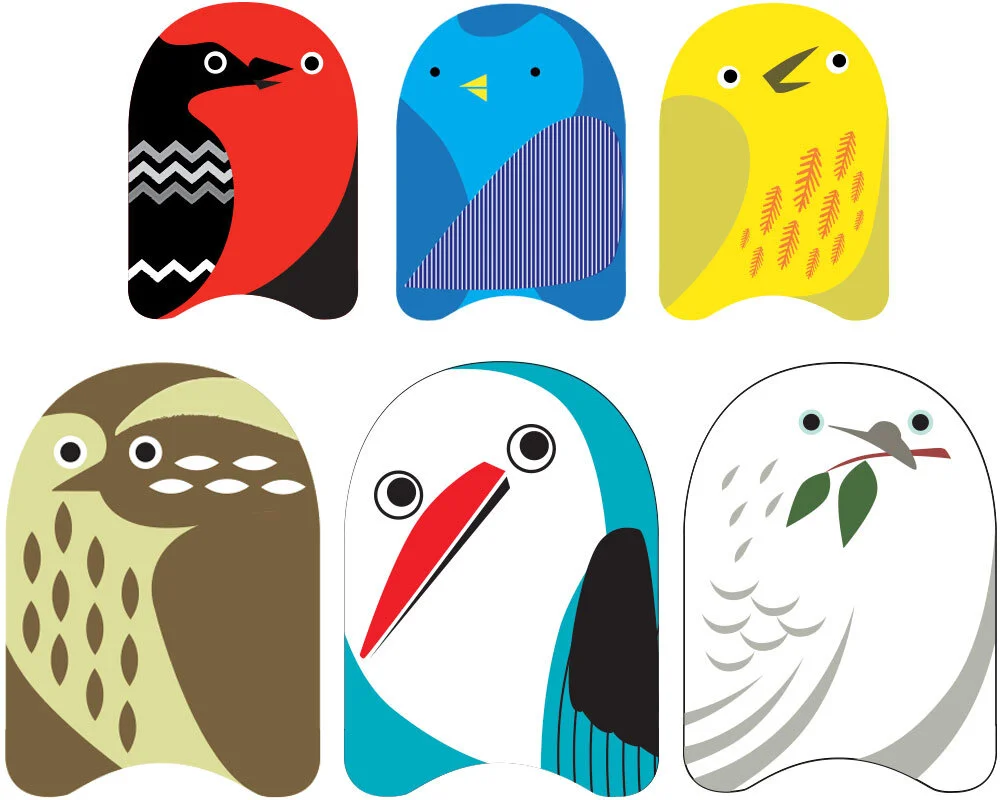
Anyhoo, it worked out that we’d make 4 Stuf families. Each made up of 4 small dolls and one big Stuf doll. You should see all the preliminary sketches I did (so many!). It was a blast, but I really wanted to make them all. The two deciding factors for the themes we went with were: current trends; and our instinct for what we knew would be attractive to Wrybaby’s wholesale clients. Pirate Stuf, Bird Stuf, and Robot Stuf were an easy leap for stores. We went with Developmental Stuf because it was a link to Wrybaby’s parenting wheelhouse. Think of it as a safety move. If the others didn’t work, at least there was a solid baby offering.

FINAL: A closer look at Pirate Stuf. I gave each pirate his (or her) own little character attributes for kids to build on. A parent once called me to say her son, who’s afraid of the water, found great comfort in his Shaggy Dan. Honestly, that alone…

FINAL: A closer look at Pirate Stuf. I gave each pirate his (or her) own little character attributes for kids to build on. A parent once called me to say her son, who’s afraid of the water, found great comfort in his Shaggy Dan. Honestly, that alone made all the Stuf headaches worth it to me. Oh, and Pirate Sue really IS nothin’ but trouble! Hahaha

FINAL: Some Stuf dolls shared pattern on the back, but had extra credit on the side panels, like Circus and Robot Stuf. I especially like how the rosy=cheeked lion sits on a little performance pedestal.

FINAL: Some Stuf dolls shared pattern on the back, but had extra credit on the side panels, like Circus and Robot Stuf. I especially like how the rosy=cheeked lion sits on a little performance pedestal.

FINAL: We pulled everything along with Stuf’s clean “European art toy” aesthetic through to it’s website and retail packaging. We made plaques for each Stuf family that made them look so special on retail shelving. And later we’d even build wood and…

FINAL: We pulled everything along with Stuf’s clean “European art toy” aesthetic through to it’s website and retail packaging. We made plaques for each Stuf family that made them look so special on retail shelving. And later we’d even build wood and canvas backdrops for each Stuf family.

FINAL: Yep! I made Stuf backpacks! The funnest part was the side water bottle pockets. The Owl’s pocket said SEEDS, and the Circus Elephant’s pocket said…wait for it…PEANUTS! Of course. :-)

FINAL: Yep! I made Stuf backpacks! The funnest part was the side water bottle pockets. The Owl’s pocket said SEEDS, and the Circus Elephant’s pocket said…wait for it…PEANUTS! Of course. :-)

We’d thought of every little thing except one. That the factory would fuck us. Oh boy, did they ever. We were working with a liason in the states who touted Gap experience and pull with a factory who was rich with Disney experience. As simple as this project was, it was a complete shock when the complete Stuf shipment arrived and only 25% of it could be sold. Yeah. While the samples they sent for approval were great, the final dolls were misprinted, sewn terribly, and…grimy. It looked like they ran the fabric over with a greasy forklift before sewing them. Not to ruin the story, but it’s important to expect the best and plan for the worst. No matter how much you try to avoid trouble, it’s inevitable in one way or another. 

But as they say, the show must go on. We had to really make sure our sellable 25% s-o-l-d. So we kept to our plan and did something you’d think we would have rethought considering the circumstances. I’ve written about how we built a snooty art brand for Stuf to live under. It was like a high-end art gallery that was only open by appointment and never answered the phone or returned calls. Hilarious and, as it turned out, hilariously effective. Stuf would soon be sold in major art museums across the country from SF MOMA to NY MOMA (you can see the complete list here).

Stuf sold through that first terrible shipment and we were able to find a new factory to make a disaster-free second round. Encouraged by Stuf’s success, we designed Stuf backpacks and we added hand-made wood and canvas backdrops for playtime with each Stuf family. OMG, the trade show booth that I designed for Stuf is still one of the best booths I’ve ever done. But that’s a whole other story.

DAVE SOPP – Creative

Yep, that’s me. I’ve got over 20 years of marketing strategy, graphic design, advertising art direction, and illustration experience. Want to use some of it? Email me at dave@davesopp.com


How to Break Into Modern Art Museums.

Strategy > Product Development

I’d designed and manufactured all kinds of products – baby clothing, children’s hooded towels, toys, stacking blocks, board books, even pacifier cases. OMG it was all so HARD. I had always wanted to make a line of plush (normal people call them stuffed animals), but was intimidated by the potential for it to go wrong. Hahaha. I’m such a chicken, but being gun-shy DID bring me success in our Mysterio line. So, I put that kind of thinking against the plush problem.

First of all, and if you know me you already know this, it couldn’t be like any plush. I didn’t want to make furry lions, or sweet teddy bears out of recycled sweaters. It had to be different. I was super intrigued by blind box art toys. Especially the artists who were sculpting one simple form, and then re-skinning that form in different ways. It seemed so simple and yet so endless what you could do within those confines. So I started noodling forms and experimenting with what could be done with them.

Where I ended up was certainly really different. Canvas forms filled with beans at the base so they stood on their own. Easy surface to print on, simple shape to sew. Manufacturing would be easy since I’d only be held to a printing minimum rather than a per piece construction minimum. I could make a lot of different dolls without a lot of expense. But it wasn’t “fluffy expected” and it wasn’t particularly “baby”. I didn’t think it mattered. I was going for something beyond expectation.

FINAL: This is Robot Stuf. Because we were funding this line ourselves we had to do it as economically as possible. Can you guess one of our methods? Right. Limited colors on each doll (notice the ON switch on the back isn’t green). But it made it a…

FINAL: This is Robot Stuf. Because we were funding this line ourselves we had to do it as economically as possible. Can you guess one of our methods? Right. Limited colors on each doll (notice the ON switch on the back isn’t green). But it made it a challenge. So what do you do when you’re limited on colors? Double down and make it work to distinguish each dolls individuality and character.

FINAL: All along It was always this simple. The form on the left was Big Stuf, 12” tall. On the right, Small Stuf, 6” tall. These were the blank factory samples we approved.

FINAL: All along It was always this simple. The form on the left was Big Stuf, 12” tall. On the right, Small Stuf, 6” tall. These were the blank factory samples we approved.

FINAL: While some Stuf families had the same patterns on the back of each doll (Robot Stuf all had ON and OFF buttons, Circus Stuf all had a shared graphic pattern), Pirate Stuf all had a bit about each pirate’s personality on the back. My favorite,…

FINAL: While some Stuf families had the same patterns on the back of each doll (Robot Stuf all had ON and OFF buttons, Circus Stuf all had a shared graphic pattern), Pirate Stuf all had a bit about each pirate’s personality on the back. My favorite, I think, was the orange Shaggy Dan who was “only a little afraid of the water”.

FINAL: Circus Stuf was probably my favorite family and it was an honor to have them for sale at the Ringling (as in Ringling Brothers) Museum of Art Florida. Pictured with the Circus Stuf family is the Big Top-themed wood and canvas backdrop I later…

FINAL: Circus Stuf was probably my favorite family and it was an honor to have them for sale at the Ringling (as in Ringling Brothers) Museum of Art Florida. Pictured with the Circus Stuf family is the Big Top-themed wood and canvas backdrop I later added to the line.

FINAL: Bird Stuf and Developmental Stuf.

FINAL: Bird Stuf and Developmental Stuf.

I always tell my clients that they need to design their audience before they design their product. I knew I wanted this line to appeal to art-types, and that because of it’s plush category nature, they’d likely be parents. So why not make collectible art plush for children? And that’s when I started working on themes. I went EVERYWHERE and it was SO fun. I eventually landed on five different sets – Circus, Bird, Robot, Pirate, and Developmental. Developmental Stuf was interesting because developmental research shows that babies respond positively to high contrast items. It stimulates their brains like crazy (in a good way).

Side note: No matter how simple you try to make things, it always gets complicated. We had hired a freelance production manager who’d worked for the likes of the Gap and we found a factory who’d manufactured for Disney, yet 75% of our container shipment arrived practically destroyed. Badly sewn, misprinted, stained and unsellable. The 25% we could use was exactly to specification, thank goodness. Entrepreneurs, know this: no matter how much you try to prevent this situation, it’s ALWAYS a possibility. Which ALWAYS sucks. 

I’d always planned to market Stuf in a special way. Like, exclusive special. So I developed a line presentation that would set it up to be museum quality from the beginning. Even the name, Stuf, gave a simplistic European flavor without the fancy umlauts. Each line of Stuf would be a limited series, and a percentage of proceeds would be donated to a specific charity related to each theme. Bird Stuf, for example, would donate to the American Bird Conservatory. Developmental Stuf would contribute to Plan. The idea was for stores to display each line of Stuf alongside an engraved plaque we had made with the charity information. When a customer brought a Stuf doll to the register, the shopkeep would retrieve a fresh product from the back for purchase. It was special art you could buy. And this is an important part of the strategy – perceived value. We set this up to look like each piece (with its charitable contributions and lack of back stock) would retail for $40 each. No. Each of the small dolls retailed for just $12.95. The big ones for just $24.95.


FINAL: Our online retail packaging was clean, simple and graphic, like the brand.

FINAL: Our online retail packaging was clean, simple and graphic, like the brand.

FINAL: Developmental Stuf in NY MOMA.

FINAL: Developmental Stuf in NY MOMA.

Finally I get to the REAL strategy part. We didn’t cop to being the creators of Stuf. We were just the DISTRIBUTERS. We never told our stores or any interested parties where Stuf came from. And this is important to building mystique. We build a whole separate website for Stuf and only offered a single Stuf email as contact info. No order forms. No list of stores that we sold to. No wholesale reps to contact to buy it. Nothing. This all lived in the background before we launched at the big NY International Gift Fair.

When Wrybaby did bring it to market, we played dumb. We found this line and we’re the distributors. It was so different from anything else in the Wrybaby booth, it was totally plausible. And we gave it wide berth to attract stores we’d never been in before. Those store were museum stores. Modern art museums. And we got their attention. Before too long Stuf was available in:

MOMA NY
MOMA SF
Contemporary Arts Center - Cinncinati
Walker Art Center - Minneapolis
The Art Gallery of new South Wales
Arkansas Arts Center
Contemporary Arts Museum Houston
Delaware Art Museum
Portland Art Museum
Tacoma Art Museum
Dallas Museum of Art
Museum of Contemporary Art Cleveland
Museum of Contemporary Art Chicago
Ringling Museum of Art Florida
The Getty Museum
The Ackland Museum NC
The Autry Museum
The Bremam Museum
Bay Area Discovery Museum

FINAL: Once the concept proved itself, Stuf got to have it’s own booth at NYIGF. So clean! I wish I had a better camera to document it. :-P

FINAL: Once the concept proved itself, Stuf got to have it’s own booth at NYIGF. So clean! I wish I had a better camera to document it. :-P

But here’s the best part. Museums liked Stuf, but we pulled the whole third-party distributorship act through to the end. Emails to the Stuf website went unanswered, or a Stuf Staffer replied vaguely. There was no phone number to call. It was like those Stuf people weren’t really interested in selling their plush dolls at all. Stuf’s website was hilariously smug. It was set up like a modern art gallery site. It only listed the products, the museums they were in (which expanded by the week), the charities it funded, and the trade shows it would be presented at. I’ll tell you, I sat on the one museums PO for months until they were calling me every day to fill our their new vendor form and ship them. Why? Sometimes the more you make people want something and the more they have to work for it, the more valuable it becomes to them. It’s the law of exclusivity. Availability works the same way.

Stuf was successful enough to warrant an INCREDIBLE trade show booth dedicated to it. Very artsy. We added cool canvas backdrops to the product line so kids could put on plays using characters from each Stuf theme. Stuf went through another reorder with another factory (much better) and we retired the line to focus on other projects. But I’ve still have the bragging rights to having my art featured in most of America’s major art museums (even if it was in the gift shops).

DAVE SOPP – Creative

Yep, that’s me. I’ve got over 20 years of marketing strategy, graphic design, advertising art direction, and illustration experience. Want to use some of it? Email me at dave@davesopp.com


How to Not Really Animate Something.

Illustration > Mr. Dave’s Best

When I was a student at Art Center, a producer for Dick Clark Productions somehow got my number and called me up with a gig (I still don’t know how that even happened). He asked me if I could do some animation titles for American Bandstand. I said, “Yes, absolutely” (as I’m want to do) and of course I’d never animated anything before in my life. Luckily I had an out when he said he didn’t have any money to pay me but I’d be in the end credits. No. Thanks.

Anyway, I never did learn how to animate. I’ve come close by doing some TV spots in San Francisco with talented animation studios. I even sort of animated some low budget stuff for VersaMe and Continuum, but those weren’t the same as the real deal. But then I found that Procreate, my favorite tablet drawing app, had a feature that recorded your pen strokes while you drew! So when your drawing was done you’d have a time-lapse animation of your drawing...well, drawing itself. I know what you’re saying. “That’s not real animation either!” I know, but it’s closer? Hahaha.

Anyway it was fun to take that app feature and figure out how to use it in a unique way. I mean, you could just record yourself drawing a character or something, but in the end you just have that finished character or something. So I had the idea of doing a slow reveal. Where you really didn’t know what the drawing would be until the very end. Or maybe you’d know what it was, but you didn’t know why I drew it until the end.

I’d been putting a lot of creative energy into my Mr. Dave’s Best brand and I’d been sharing one theme a week on Mr. Dave’s Best Instagram account. I made these little videos the “Saturday Night Mystery Movie”, where I challenged viewers to try and guess the video topic before it was revealed at the end. Fun, right?

I’m sharing here a collection of my most favorite Mr. Dave videos. I don’t think any of these represent my best illustration work. Not at all. The whole thing was more of a conceptual piece. My challenge to myself was to get through each of these drawings quickly. I didn’t want the videos to be too long or illustrate themselves too fast. I also did each drawing in one take. Maybe this was just user error, but if you screw up a lot (like I do), it’ll totally mess up your video. And I was working with no previous sketch or practice at all. I was just banging them out. I exported the videos from Procreate to my Mac, where I’d pop them into Adobe Premiere for a quick edit and some title additions. The music is all SUPER public domain from a website I found filled with all kinds of terrible, scratchy, atrocities. Mostly a bunch of recordings of Edison (yeah, Thomas), recorded by Edison, telling terrible jokes. Anyway, I thought the clunky antique music fit well with my retro brand and bounced hard against my decidedly non-traditional themes. How many video topics can you guess before they end?

DAVE SOPP – Creative

Yep, that’s me. I’ve got over 20 years of marketing strategy, graphic design, advertising art direction, and illustration experience. Want to use some of it? Email me at dave@davesopp.com


How to Make a Fan Happy.

Design > Promotional Merchandise

I love music. Always have. I’m a big power pop fan, and I like going to shows. It’s kind of hard living in Mooresville because not a lot of bands get near here (it’s getting better, thank God, but still). So when a band I like DOES find its way to Charlotte, I’m there. And the first place I go when I get there is the merch counter because I’m looking for a t-shirt or something to support the band (even the big acts). It’s always so disappointing. It all just sucks so bad. Same with bars I like (except my favorite in SF). Or breweries. Look, a logo on a shirt is fine (if the logo is half decent), but what about something that captures the spirit of the place? You know, a little extra credit for the fans?

FINAL: I made the first round of Downtown Mooresville t-shirts do more than early adopter fans, but to clothe volunteers at events and hand out to Downtown supporters in Town Hall.

FINAL: I made the first round of Downtown Mooresville t-shirts do more than early adopter fans, but to clothe volunteers at events and hand out to Downtown supporters in Town Hall.

d_downtown_promos_04_02.jpg

Every time I have to work on promo merch I think about that. The first shirts we designed for Downtown Mooresville were ads. They had to be, because we didn’t have fans yet and most of these shirts were going to be worn by volunteers handing out our Downtownie Passports or directing folks to the bathroom at events. Merchants would get them for free to wear around Lake Norman during their off hours. So we made them in Downtown’s bright-ish orange so that they’d be SUPER visible. Even the sushi place, which still kept pushing their rogue name (DoMo) after the branding began (grrrrr) framed our first T-shirt and hung it in a prominent place. (How could we be mad at them?). I wrote a post about taking advantage of every opportunity and, please, if you ever get a project like this, give it the full force of your thinking. Because this little T-shirt will not only represent your brand, but will also project it to LOTS of people who don’t know it. And just know that a person bothering to wear it LOVES your brand! So why not do them a solid?

FINAL: The second round of Downtown Mooresville shirts featured cooler (not a bright orange!) colors and our nifty logo that was, by this time, pretty well known.

FINAL: The second round of Downtown Mooresville shirts featured cooler (not a bright orange!) colors and our nifty logo that was, by this time, pretty well known.

The second go around at the Downtown merch was a little different. We finally had fans! Hahaha. So we finally printed on hipper colors and showcased the logo (it looked sharp). They sold! Then we started making pint glasses and wine glasses. All the best Downtown bars and restaurants had ‘em for sale, and the Downtown Commission raised a tent at every event which was fully stocked with glasses, brochures and the T-shirts. It’d be super easy to just pop a logo on a glass, so of course we didn’t do that. We made them fun little ads. At one point, and I think this idea came from one of our merchants, we made bar coasters for Downtown. Of course we stocked up all the Downtown restaurants, but cunningly, someone got them passed out to bars on the Lake Norman side of town - and they used them! THEY WERE ADVERTISING DOWNTOWN IN THEIR COMPETITIVE BARS AND RESTAURANTS. I can’t believe I don’t remember who did that, because THEY are the true marketing geniuses.

DAVE SOPP – Creative

Yep, that’s me. I’ve got over 20 years of marketing strategy, graphic design, advertising art direction, and illustration experience. Want to use some of it? Email me at dave@davesopp.com


How to Draw Yourself Out of Trouble.

Illustration > VersaMe

Being able to draw gets you out of a lot of sticky design situations. Maybe I lean on it too much, but if I need a technical illustration of a product I’m doing a brochure for, it’s easier for me to just whip one out myself without having to go find someone to do it, get an estimate, get an ok to spend the money, wait for them to fuck it up a couple of times before I like it and then get back to work. Who’s got time for that?

CHEATING: Yep. This is my animation cheat. Same head, different mouths. This is what I gave my talented After Effects friend so he could do the fake animations for our video.

CHEATING: Yep. This is my animation cheat. Same head, different mouths. This is what I gave my talented After Effects friend so he could do the fake animations for our video.

CHEATING: Same with this. I gave him a ton of different mouths for both characters so they’d look like they were blabbing.

CHEATING: Same with this. I gave him a ton of different mouths for both characters so they’d look like they were blabbing.

CHEATING: Same here. Below is all this cheating in action. :-)

CHEATING: Same here. Below is all this cheating in action. :-)

d_versame_illustration_04.jpg
d_versame_illustration_05.jpg

Being an illustrator also comes in handy getting ideas across. Fast. When I was working with VersaMe (they made the Starling early education wearable), I had LOTS of opportunities to put my drawings to work. I’d had to make a series of YouTube videos, from scratch, in about a week. So I figured out an idea that would work, populated the spots as much as I could with stock photos and then filled in the gaps by hand. The spots were heavy on After Effects (lots of stuff zooming in and out and such) so the drawings had to have a little extra something something to spice things up.

Oh, I’m no animator. I mean, I’d love to be, but I don’t have the time. So I faked it. I drew out tons of key frames and handed them over to my After Effects editor to do his magic with ‘em.

There were also a lot of technical drawings to be used in gif animations I’d end up building for onboarding tutorials. But the really fun stuff, personally, was concepting story ideas for an educational gaming app we were developing to tie into the Starling. We had a handful of story ideas that we wanted to test via Facebook ads. Really shoestring market research – the ad with the most clicks for more info was the theme that won. I’m a big fan of those old Bell Science Films, and I wished and wished that the child-brain-cross-section idea was the winner. It totally wasn’t. Mad Face Emoji!

dave_bug.jpg

DAVE SOPP – Creative

Yep, that’s me. I’ve got over 20 years of marketing strategy, graphic design, advertising art direction, and illustration experience. Want to use some of it? Email me at dave@davesopp.com


How to Make Cheap TV That’s Still Super Creative.

Advertising > Video

Commercials. Expensive to run, right? Not if you’re a cable company! It’s free! Run them across all channels whenever! Woo hoo! Oh, wait, but they’re expensive to make. Nope! Not if I’m making ‘em! Double Woo Hoo! Look, despite being able to run free media, Continuum was just a small communications company with a lot of expenses before paying for TV production. But doing TV was too good an opportunity for them to just dismiss it. Especially with all that free media at hand. So we set out to bring our brand to life through Adobe After Effects and and an first-time local voice talent.

A career preference for working for scrappy, low budget underdogs has taught me that you don’t need a lot of money to make a good tv spot (or video or whatever). You just need a good idea and a talent for using the resources at your disposal. The YouTube video work I’d done a year earlier for VersaMe racked up TREMENDOUS view through numbers, so why not double down on the formula for a cross-channel cable flight for our local communications company?

Remember, the Continuum name and logo was in charge of projecting “reliable” . Everything else was in charge of “local”. So we decided on this strategy: slick “animated” spots, with a folksy, homegrown VO, and a strong finish. Our voice talent was Tracy Bennett Smith, a charming banking professional with a distinctive accent and no VO experience whatsoever. How’d we find her? Soccer practice. Doesn’t get scrappier than that. For the After Effects work, we stuck with the talented Peter Baker, who’d done such amazing work on the VersaMe videos.

There was one more bit of creative strategy we applied. We decided to build the spots as bumpers. That means, as a viewer, you’d see a :15 Continuum spot at the start of the commercial break, then a bunch of national commercials before seeing another :15 second spot before your show started again. We used this format to make CLIFFHANGERS! OMG, it was so fun to write these. We’d set up a proposition at the beginning and pay it off at the end. It was fantastic. Nobody does that anymore, so it was great theater. They became sort of like little special station identification break-ins. Only fun.

We got to be our true southern selves and show off our local personality, all the while projecting a strong sense of reliability. More to the point, this showed people that we were a communications company you could actually, gulp, like?

DAVE SOPP – Creative

Yep, that’s me. I’ve got over 20 years of marketing strategy, graphic design, advertising art direction, and illustration experience. Want to use some of it? Email me at dave@davesopp.com


How to Go All In.

Advertising > Social Media

I’m not a big social media guy. I get it. And I understand that a lot of people are very all about it. I just don’t have time for it, personally. I think it’s because when I do something, I like to go all in. And the danger of that is that it’ll take a lot of my time and thinking. It’s too maintenance heavy. For example, the time I brought Mysterio to Instagram. Mysterio is a creation of mine – an infant mentalist who predicts your baby’s future on a t-shirt. Mysterio had been a best-seller for Wrybaby for years, and Kelly and I were about to take our boy on a trip to Cambodia and Vietnam. We were visiting some amazing places that would probably be pretty mundane in Mysterio’s world. So I decided to have some fun and not just make Mysterio real, but also make him his own Instagram account. He was going to have an ADVENTURE!

ad_social_mysterio_01.jpg
ad_social_mysterio_03.jpg
ad_social_mysterio_06.jpg
ad_social_mysterio_07.jpg

What I didn’t want to do was to be Mysterio on my trip. I’d have to get into the tux and turban whenever Mysterio wanted to post a selfie and that sounded...inconvenient. Also I couldn’t be very spontaneous. So instead, I decided to never show Mysterio. Or, at least his face. I got some pretty silk fabric and had Kelly make me a jacket sleeve with a white shirt sleeve inside it. Just one sleeve with elastic up at the top and a cuff at the bottom. Then I bought some fancy white formal gloves and voila – an instant, travelable Mysterio costume! I kept the sleeve and gloves in my bag so that whenever I had an idea, I could slip them on, take my photo, and post away. 

ad_social_mysterio_08.jpg
ad_social_mysterio_09.jpg
ad_social_mysterio_10.jpg

We invented the story before we left – Mysterio was coming to visit Wrybaby and then head out on a dangerous, exotic buying trip. What would happen along the way, Kelly and I just made up as we traveled. Mysterio ended up having all kinds of problems on his journey. He was lost, drugged, kidnapped, oh I’ll just let you follow his story. The photos at the beginning show Mysterio shaking hands with folks at Wrybaby. The Mysterio hand shaking mine is actually Kelly’s. Hahaha. From the outset I think the boutiques who stocked Mysterio thought our Instagram feed was going to be some lame sales thing (they didn’t know we were traveling to Asia), so imaging their surprise when he started posting so many exotic locales! Like I said before, when I decide to do something, I’m all in. I’m glad it was a limited series!

DAVE SOPP – Creative

Yep, that’s me. I’ve got over 20 years of marketing strategy, graphic design, advertising art direction, and illustration experience. Want to use some of it? Email me at dave@davesopp.com


How to Give the People What They Want.

Illustration > Mysterio Predicts

I’m not Mysterio. Well, sometimes I had to be at trade shows. But I originally drew Mysterio with no thought of him being me. Some people also go to Zoltar, the mechanical mystic from the movie, Big. Nope. It’s funny that our collective image of exotic mentalists are all kinda the same guy. I’ve got that big, beautiful Taschen book of Magic and when you look through the history of magician-types, those guys are all doing the same look! For the branding work I did for Continuum (a communications company), I talk about avoiding cliches. But, honestly, sometimes you have to give the people what they expect if you want them to understand something. Oh, sorry, if you don’t know, Mysterio is a mystic who predicts your baby’s future on a little t-shirt. See? Totally appropriate and no way around it. I toyed with using a top hat instead of a turban, but he looked too Fred Astaire. Like he’d take your baby tap dancing.

FINAL: Mysterio…such a jerk. But being serious makes him believable. I didn’t really have a lot of reason to draw him outside his logo, but once in a while I needed him to have a body. You may say “lazy” but I thought it was funny to keep his logo h…

FINAL: Mysterio…such a jerk. But being serious makes him believable. I didn’t really have a lot of reason to draw him outside his logo, but once in a while I needed him to have a body. You may say “lazy” but I thought it was funny to keep his logo head exactly the same in any scenario. He’s so INTENSE! hahahah.

SKETCHES: In 2006 I started trying to figure out what Mysterio was going to look like. I distinctly remembering being bored in a trade show booth in San Francisco, so that’s why the three stacked sketches are so shitty. But that last one really seem…

SKETCHES: In 2006 I started trying to figure out what Mysterio was going to look like. I distinctly remembering being bored in a trade show booth in San Francisco, so that’s why the three stacked sketches are so shitty. But that last one really seemed to be the one, no? I remember I didn’t do that many before heading in that direction. The strip of heads up top was me working my way toward finish (far right). I’d never done shading like Mysterio seemed to demand (the etching style). It’s hard! Anyhoo, once I got to a finish I did there little extras for the packaging. In the beginning I softened Mysterio by saying he also sewed all the shirts himself.

EXTRAS: Once I got comfortable drawing in the Mysterio style, I started doing little extras here and there for customers. Here’s an early version of Mysterio’s origin story that I did as a free comic download. To the right are the Spirit Animals fro…

EXTRAS: Once I got comfortable drawing in the Mysterio style, I started doing little extras here and there for customers. Here’s an early version of Mysterio’s origin story that I did as a free comic download. To the right are the Spirit Animals from Mysterio’s free downloadable Cootie Catcher.

SKETCHES: Some early rough pencil sketches for Mysterio’s children’s book, A Future Just for You!

SKETCHES: Some early rough pencil sketches for Mysterio’s children’s book, A Future Just for You!

FINAL: Illustrated spreads from Mysterio’s picture book, A Future Just for You.

FINAL: Illustrated spreads from Mysterio’s picture book, A Future Just for You.

illust_mysterio_05.jpg

As the Joker once said, “Why so serious?” After all, it’s for a BABY. Exactly. I wanted Mysterio to look intense to add some gravitas to the thing. Look, imagine if he was some happy winking cartoon dude, it’d ruin the whole thing. The way he’s STARING, part of you has to wonder...will this prediction really come true? Also, this was made to be a baby shower gift. So it’s all theater when it’s opened in front of a party. Looks serious, ends up being ridiculous. Get it?

Still I had ideas on how to soften him up a bit. I had a whole backstory planned for him, like how he sewed the shirts himself and somehow imprinted the shirts with a blast from his eyes, but I never played it up. I once made a comic book about his origin story. It was an extra credit free download for a while at wrybaby.com. And, of course, I illustrated a children’s picture book about Mysterio’s powers. That really softened him up. I even brought him to life on Instagram for a while! Hahaha. In the end, I think I prefer him looking like his tagline description: Uncanny! Almost Scary!

DAVE SOPP – Creative

Yep, that’s me. I’ve got over 20 years of marketing strategy, graphic design, advertising art direction, and illustration experience. Want to use some of it? Email me at dave@davesopp.com


How Packaging Can Set the Stage.

Design > Packaging

Mysterio’s product is super unique. And as I mentioned, things people have never seen before are hard to package. Mysterio tells you your baby’s future on a little t-shirt. There are 12 possible futures (all party safe), and each is sealed up in this bag so that it’s a surprise when you open it. Back in 2006, I didn’t think I had to explain that last part – what with blind box toys getting more and more popular each year. But trust me, the average consumer STILL needs all of this explained to them. Sigh. I’ll share some business and behavioral lessons we learned as I go.

FINAL: Mysterio’s packaging had to do SO MUCH. Tell you what it was, what it did, what the possibilities were, what the guarantee was, where it was made, who made it, and even how to open the goddam thing,

FINAL: Mysterio’s packaging had to do SO MUCH. Tell you what it was, what it did, what the possibilities were, what the guarantee was, where it was made, who made it, and even how to open the goddam thing,

Anyhoo, that’s a lot of work for a little muslin bag! Which is why the whole front of the bag is the product description. The back? All support, no filler. Build up the experience while explaining the experience. We did this for another reason, too – the end user experience. If you haven’t been to a baby shower, here’s how it works. There’s a lot of games and chit chat and cake and such, and then everyone gathers around to watch the mom-to-be open her gifts. When she gets to Mysterio, she’ll likely read the bag out loud before opening it. Therefore, she’ll be explaining to everyone exactly what to expect while building anticipation. Show time!

And this is why, at first, we didn’t list the futures on the bag. We printed the on the wood display so that when Mysterio’s t-shirt was given, nothing would lead the giftee (or her audience) to think their surprise future would be more funny than aspirational. Good idea for the consumer, bad idea for our bottom line. Why? Because on our next reorder from the factory, we decided to freshen up the futures. But we still had a ton of displays. So that meant printing new lids for everyone who already had displays. Woof.

FINAL:And this is Mysterio’s packaging from way back in 2006. Lots of lessons learned along the way! This was when we tried to make the bag easy to open by just pulling the top string (big mistake) and relied on a lot of copy to get the story across…

FINAL:And this is Mysterio’s packaging from way back in 2006. Lots of lessons learned along the way! This was when we tried to make the bag easy to open by just pulling the top string (big mistake) and relied on a lot of copy to get the story across (big mistake; no one wants to read).

The first bag was also easier to open. On the first two rounds of production, all you had to do was pull a red string to open it (like a bag of charcoal or dog food). For dramatic effect, we wanted to make the opening act (see what I did there?) was as seamless as possible. We didn’t want to interrupt the mood we’d built up by having someone run off to find scissors, leaving everyone in awkward silence until they returned. This, however was a big mistake – for retail stores. Why? Because their customers were opening all the bags, searching for the future they liked the best. What the fuck is wrong with people? One store watched Puff Daddy’s personal chef do that, but at least he paid for all the ones he opened before he left. Anyway, we got tired of paying to re-sew all the bags closed. So now, you gotta have scissors at the ready to open it.

Speaking of construction, the pinked edges of the bag were designed to give it a roughness. Sort of an economical, controlled fraying. Oh, and while we always offered the wood display, some stores decided the display wasn’t worth the nominal fee and made their own thing (which usually translates to standing them up in a basket where no one will see them). Then they complain the shirts aren’t selling (which never happens), so they finally buy a display, and then they sell through their stock. But still, we wanted to give options. That’s why we eventually added the brass grommet up top. So if stores really didn’t want or have room for the display, they could at least hang it on a peg on a wall slat, and the front of the bag can do it’s job. Options are always good. It costs more to do, but didn’t detract from the product and it enhanced its sellability.

COMPS: Two bad ideas. Megastore Buy Buy Baby wanted to try Mysterio out, but didn’t want the wood display. That’s when we had to start thinking about alternate solutions. This on the left was the quick fix to make it work with inventory we already h…

COMPS: Two bad ideas. Megastore Buy Buy Baby wanted to try Mysterio out, but didn’t want the wood display. That’s when we had to start thinking about alternate solutions. This on the left was the quick fix to make it work with inventory we already had. Oh, and we felt like we had to dumb the paper hanger down A LOT for a mass market (which would still be true today). Workable, but I like the grommet we did later better. And on the right is a quick fix for our displays when we changed up the futures. Not a bad solution, but not an ideal long-term one.

Let’s talk about extra credit. I say, it’s for chumps. Here’s a good example. When we switched to scissor-open-bags, I wanted to add something to add some stability. It always sort of bothered me that the bag was so floppy and light. I know, it only held a tiny folded t-shirt, but still. I also didn’t want people cutting through the t-shirt while opening the bag (see, I was learning!), so I added a thick cardboard card with an outrageous guarantee. If Mysterio’s future wasn’t correct by the time the child was 70, you could return it for a full refund. Funny, but not to our lawyer. At least until I showed him the legalese attached to the guarantee:

*Claims must be submitted with original receipt and the allegedly inaccurate garment upon which Mysterio’s prediction must be legible. Substituted garments will void this offer (besides, Mysterio will know you were trying to trick him). Claims shall also include a facsimile of child’s birth certificate, complete grade school transcripts and college transcripts (if applicable). Please also include an essay by the child, in his or her own words explaining the circumstance of his or her failure to achieve the destiny predicted by Mysterio detailing any conflict of personal hopes and/or dreams. As all claims will occur in the distant future, before submitting your claim, please consult a psychic or other such mystic for information regarding Mysterio’s whereabouts. Reimbursement will consist solely of the garment’s original purchase price minus sales tax and minus any delivery fees Mysterio shall incur. If said fees exceed the refund amount, you will receive an invoice from Mysterio of the balance owed to him by you. Invoice will be payable immediately. Failure to remit payment will result in dream-state visitations to the claimant by Mysterio until the balance is settled. By reading this agreement you promise to see the futility in filing a claim and to realize that it’s perhaps easier to go ahead and just fulfill Mysterio’s prediction by doing what he said you’d do.

Fun little extra spice to add, right? Nah. It added a new vendor to production, drove up the manufacturing cost, and in the end I don’t think anyone really cares. Maybe it was just too much. Like a smart friend of mine is fond of saying, “It’s a joke on a joke”. Unnecessary. We’re heading into our 10th reorder of Mysterio shirts, so if you want one with a guarantee, you’d best order one now before they’re gone. Hahaha.

DAVE SOPP – Creative

Yep, that’s me. I’ve got over 20 years of marketing strategy, graphic design, advertising art direction, and illustration experience. Want to use some of it? Email me at dave@davesopp.com


How to Expand a Magical World.

Design > Product

I’ve said before that your packaging is as much the product as the product is. This is another example of how true that is. If you don’t know, Mysterio makes a baby t-shirt that can predict your child’s future. Kelly and I had just published a children’s picture book about Mysterio and we were looking to expand his product line. Mysterio was always more of a gift for parents than a gift for baby. Sure, the baby got a shirt. But the parents, the baby shower guests and the gift-giver, all got a fun, memorable experience. So why not develop more experiences for them

FINAL: BEHOLD! Mysterio’s Deluxe Keepsake Chest! An expansion of the Mysterio infant t-shirts that predict your baby’s future. It was so fun to play in this sandbox from a design and illustration standpoint. Almost too fun. In the end I made way too…

FINAL: BEHOLD! Mysterio’s Deluxe Keepsake Chest! An expansion of the Mysterio infant t-shirts that predict your baby’s future. It was so fun to play in this sandbox from a design and illustration standpoint. Almost too fun. In the end I made way too much stuff for it. Made it a little hard to explain all the contents!

That’s where Mysterio’s Keepsake Chest came from. It was a deluxe collection of Mysterio’s baby shirt, his book, two fun games, a wooden top, and a paper craft. Over the years, customer feedback told us that people really did keep Mysterio’s shirts once their baby’s grew out of them. How fun to see if the future would eventually come true! So one of the games we developed predicted more specific events – Milestones. At the bottom of the box lies the game board and a heavy card filled with milestones. Spin the top and name a milestone. When it stops, it will point to the age at which the child will reach that milestone. Write it down on the card. Easy! The fun part is discovering that your child’s first haircut will happen at 58 years of age. Yes, all silly, good fun at a baby shower. Flip the game board over, and you’ll find that Mysterio will answer any YES or NO questions you have. Again, ask the question, spin the top, get Mysterio’s answer.

FINAL: SEE?! TOO MUCH STUFF! The tag on the outside had a list of contents (as brief as I could make it), but it still read like a novella. The game board that’s flipping up? That’s two games on one board. Of course it comes with a one of Mysterio’s…

FINAL: SEE?! TOO MUCH STUFF! The tag on the outside had a list of contents (as brief as I could make it), but it still read like a novella. The game board that’s flipping up? That’s two games on one board. Of course it comes with a one of Mysterio’s signature baby t-shirts and his new picture book.

FINAL: A close up look at the Ask-O-Meter! Think of it as a flat, paper, much sassier Magic 8-Ball. I’ve got one of these in our living room and we use it all the time to make YES or NO decisions for us. I like how a lot of the answers end up being …

FINAL: A close up look at the Ask-O-Meter! Think of it as a flat, paper, much sassier Magic 8-Ball. I’ve got one of these in our living room and we use it all the time to make YES or NO decisions for us. I like how a lot of the answers end up being sort of confusingly ambiguous/

FINAL: The flip side to the Ask-O-Meter is a fun way to record when your baby will meet their major development milestones. What’s so funny is how horribly wrong Mysterio’s predictions get. First Tooth could be at 51 years, for example. Hilarious.

FINAL: The flip side to the Ask-O-Meter is a fun way to record when your baby will meet their major development milestones. What’s so funny is how horribly wrong Mysterio’s predictions get. First Tooth could be at 51 years, for example. Hilarious.

FINAL: There’s even a little papercraft Mysterio that you can pop on a shelf to keep a mystical eye out for baby. I like the extra credit (which I always say is for chumps) of printing a back to the paper Mysterio complete with all the instructions …

FINAL: There’s even a little papercraft Mysterio that you can pop on a shelf to keep a mystical eye out for baby. I like the extra credit (which I always say is for chumps) of printing a back to the paper Mysterio complete with all the instructions reversed as well. And here’s a shot of me tying up a box to ship out. I’d do 100 of these at a go and it KILLED my fingers. The things you do for art.

I think my favorite part of the whole thing was the clever packaging. We stuffed the box with wood excelsior so it looked all wild and exotic. We even slid the lid closed to leave some of the curly fill sticking out because it looked so cool. And just like we did on his baby shirt packaging, we let the lid be pretty simple and straightforward. We used a paper tag to really detail all the info. But even the tag was cool because, as the gift-giver, you could clip off the contents part and be left with a nice gift tag to fill out. Then, the giftee could discover the contents on their own. Also, it looked WAY not-commercial that way, too. Oh, and to keep people from getting into the box in stores (I already learned they would try), I wrapped each one with heavy rope and fastened it tight with heavy black wire. It killed my hands (yes, I wrapped them all myself), but it was totally worth it.

When baby was too big for Mysterio things, the whole kit and kaboodle could be stored away in Mysterio’s handsome wooden chest. Someday, far in the future, the child would find it, and have a good chuckle.

DAVE SOPP – Creative

Yep, that’s me. I’ve got over 20 years of marketing strategy, graphic design, advertising art direction, and illustration experience. Want to use some of it? Email me at dave@davesopp.com


How to Turn Iffy QC into an Asset.

Strategy > Mysterio Predicts

Making things sucks. There. I said it. Kelly and I had been manufacturing goods for Wrybaby for years and whether it was done domestically or overseas, it always sucked. It’s just a lot of moving parts that can go wrong. And we weren’t even making complicated stuff! We had our share of screen printing problems in the US and we once had our inventory held for ransom in India WHILE WE WERE THERE VISITING THE FACTORY. Understandably, when it came time to think up a new product in 2005 we were feeling pretty sour. So we gave ourselves this challenge: Can we design a product that, if it arrived all messed up, would still be ok to sell, if not improved, by its defect?

FINAL: This is how consumers meet Mysterio for the first time. Curb appeal for days and all the result of outsmarting a quality control problem. I specified using rough-sawn wood for the crate box knowing it wouldn’t print very well on the front. Th…

FINAL: This is how consumers meet Mysterio for the first time. Curb appeal for days and all the result of outsmarting a quality control problem. I specified using rough-sawn wood for the crate box knowing it wouldn’t print very well on the front. That way I’d never be disappointed with how badly AND it sets the stage so well for the product.

That’s when Mysterio was born. Honestly. As exotic and fun and popular as Mysterio’s baby tees are, it’s totally one of those really disappointing “How I met my spouse” stories, like, “Oh, we were drunk in Vancouver and hooked up and got pregnant, so...”. Mysterio was a child of past failure. See, maybe you know this, but manufacturing overseas sucks for small orders. The sewing, for example, can be kinda janky even if it’s something the factory specializes in. Like onesies. You’ve got QC, but still some crap sewing sneaks through. Sometimes a lot. The printing is even more iffy: It’s off center, faded or too dark; or smudged because it’s done across town with someone your factory contracted with. Get it? Good luck getting anyone to take responsibility for anything when you see it come back all messed up. And again, that’s on stuff they all specialize in.

So given our challenge, we went rustic. We went old world. Exotic. Mystic. We started with the aesthetic. What could you make that, if it arrived messed up, looked like that was intentional to reflect being handmade, or primitive, or of exotic origins? And how would that product relate to a new baby (which Wrybaby specialized in)? 

At this point in our own parenting adventure, we were past the “how will we keep it alive” phase and entering the “what will it be someday” phase. So, I don’t know, it became sort of a no-brainer to make the connection. What if we created a garment that told the baby’s future? It could come in a printed bag that was sealed, so you didn’t know the future until your opened it? What if we built it up to make people think the futures would be amazing and then they weren’t? What if they were kind of hilariously odd? Like, how you can wonder sometimes how anyone grows up to find their passion as a Shrimp Boat Captain? Or a Romance Novelist?

FINAL: The current product packaging, front and back. We’d added the grommet to give our stores more display opportunities. You can see how the printing on the front is a bit off-center (a bit too far to the left). If it was on an envelope or a box,…

FINAL: The current product packaging, front and back. We’d added the grommet to give our stores more display opportunities. You can see how the printing on the front is a bit off-center (a bit too far to the left). If it was on an envelope or a box, I’d be pissed. But because we used a sewn bag, you totally forgive it.

FINAL: Clip the bag open and VOILA! Your baby’s future. Boom.

FINAL: Clip the bag open and VOILA! Your baby’s future. Boom.

It all unfolded from there. We didn’t even test it. We just went all in. We developed a wood crate display for stores with tons of curb appeal. It’s made by a US company who is AMAZING, but still, their shipper dropped our palette and half of the crates splintered, cracked or flat out broke. DIDN’T MATTER! In fact it made them better. They looked like they were just thrown off a boat from Cambodia.

The product itself is a little complicated to explain, being so unique. It makes a bit of heavy lifting for the little muslin packaging, but here it is: Mysterio predicts your child’s future on a t-shirt. There are 12 possible futures (which, btw, we change up every year) and each future is sealed in a muslin bag. Clip open the bag to reveal your baby’s future. 

In 2005 people weren’t very trusting that the futures wouldn’t be something stupid, dirty or terrible. So, we listed all 12 futures on the lid of the display crate so customers knew what they were in for. Eventually, we put the futures on the back of the bag (for reasons I mention in another article.) We succeeded in creating an amazing baby shower gift that was memorable because of great suspense and theater it created at parties. And talk about having a keepsake for that child to discover decades later when they really achieve their career goals! Creative moms-to-be have even used Mysterio Tees to let their husbands know they’re pregnant. Boutiques around the world found that Mysterio customers became steady customers, as Mysterio became the proven go-to baby gift. One boutique told us that Puff Daddy sent his personal chef (why the chef we’ll never know) to open all the Mysterio’s in the shop until he found Criminal Mastermind. He paid for everything he opened and left with his prize.

FINAL: Mysterio’s money-back guarantee along with some product extensions. His deluxe Keepsake Chest, his picture book, and even little freebie goodies like a papercraft Mysterio you can consult in times of indecision.

FINAL: Mysterio’s money-back guarantee along with some product extensions. His deluxe Keepsake Chest, his picture book, and even little freebie goodies like a papercraft Mysterio you can consult in times of indecision.

Over the years we’ve tinkered with Mysterio here and there. In the beginning all you had to do was pull the string to open it, but too many people just opened them in stores until they found one they liked. So now you have to cut it open. We added a silly guarantee the your future will be accurate by the time they’re 70 (and even still there’s a ton of impossible legal stipulations). We even released a limited keepsake box full of games, an inspirational book about Mysterio, his t-shirt and even a paper craft doll Mysterio doll to guard your child’s aura. Mysterio continues to delight, and I’ll be sure to update this post soon. He’s got some new, amazing products in the works as I write.

DAVE SOPP – Creative

Yep, that’s me. I’ve got over 20 years of marketing strategy, graphic design, advertising art direction, and illustration experience. Want to use some of it? Email me at dave@davesopp.com


How to Make Fun of the Helpless.

Illustration > Safe Baby Handling Tips

Fun fact about my book, Safe Baby Handling Tips: That’s me and Kelly in all those drawings! We were living in SF and I was doing a rockabilly thing with vintage red tab Levis and no handlebar mustache. You can see Kelly go through a couple of hair styles between Safe Baby Handling Tips and its prequel follow-up, Safe Pregnancy Handling Tips. I’ve written about how we came up with the idea, but the intention of the drawings was to mimic instructions for power tools. Not airline emergency instructions. Not IKEA assembly instructions. There’s actually an important distinction here.

FINAL: The first edition of the book in question – Safe Baby Handling Tips circa 2005. Look at that handsome rockabilly devil, will ya?

FINAL: The first edition of the book in question – Safe Baby Handling Tips circa 2005. Look at that handsome rockabilly devil, will ya?

FINAL: Like painters in all the cartoons who paint live models, illustrators use photos for reference.. We call it “scrap”. Before computers, I knew illustrators who had rooms full of file cabinets packed with torn out magazine pages, photos, all ki…

FINAL: Like painters in all the cartoons who paint live models, illustrators use photos for reference.. We call it “scrap”. Before computers, I knew illustrators who had rooms full of file cabinets packed with torn out magazine pages, photos, all kinds of scrap (see!?) paper with stuff they could reference in their work. I like this photo because of the baby laying on the ground behind me. Looks like I totally missed!

FINAL: A couple of my favorite panels. It takes people a while to see what’s so wrong about Shopping with Baby, which is fun to watch. Drying Baby is so moronic and mean it never fails to crack me up. Same with the Lifting Baby detail (what a grip!)…

FINAL: A couple of my favorite panels. It takes people a while to see what’s so wrong about Shopping with Baby, which is fun to watch. Drying Baby is so moronic and mean it never fails to crack me up. Same with the Lifting Baby detail (what a grip!). Oh, and a little something from Nursing Baby to keep you up at night. Yep, that’s me. I’ll spare you the scrap I shot for it.

FINAL: Another true life adventure in scrap shooting (courtesy of Bonding with Baby). And two of my favorite Kelly panels. She cut her hair short in the middle of the project and I kept it accurate. So when you read through the book you can tell wha…

FINAL: Another true life adventure in scrap shooting (courtesy of Bonding with Baby). And two of my favorite Kelly panels. She cut her hair short in the middle of the project and I kept it accurate. So when you read through the book you can tell what was done first and what was done later. Don’t ask me why all our furniture was labeled.

My dad and my granddad always taught me that you have to respect your tools. You understand their power and never forget that you need to be mindful when using them. Let your mind wander, and bad things can happen. That’s what I thought about when we had our baby. As long as you stay mindful and not be a moron, no one will get hurt. It’s a weird twist, but you follow me, right?

If you read about the strategy behind Safe Baby Handling Tips, you know I didn’t have a lot of time to mess around drawing these. They’re simple, but they had to be realistic enough to need scrap for me to work from. Because what I’d do if I had time is take photos of people recreating the actions and then draw from that. I did that, but then traced the images in a stylistic way so I could scan them, clean them up in Photoshop, turn into vectors in Illustrator, and then pop them into frames fast. The stuff I couldn’t shoot, I just drew freehand which turned out to be pretty efficient.

COMPS: of course there were a lot of ideas that didn’t make the book for one reason of another. When we did the 10th Anniversary update/expansion we had to nix some panels because technology made them obsolete. They just don’t make TVs like that any…

COMPS: of course there were a lot of ideas that didn’t make the book for one reason of another. When we did the 10th Anniversary update/expansion we had to nix some panels because technology made them obsolete. They just don’t make TVs like that anymore and we didn’t feel like a flat panel would be as funny. And somethings our editor at Running Press nixed to save us from ourselves. Co-Sleeping is too scary and real a problem, for example. And even though we have a booze related panel (Calming Baby) it was not recommended where this one we flipped it to be the YES. Bad. And I added some that were just shitty for fun. That’s a string of firecrackers I’m lighting over there for the unpublished, Teaching Baby to Crawl.

FINAL: New directions for Safe Baby Handling Tips. Clockwise from top left: 1. If dogs are the new children, a Safe Dog Handling Tip series seemed appropriate. 2. We played with the idea of offering our Handling Tips on adult apparel, canvas totes, …

FINAL: New directions for Safe Baby Handling Tips. Clockwise from top left: 1. If dogs are the new children, a Safe Dog Handling Tip series seemed appropriate. 2. We played with the idea of offering our Handling Tips on adult apparel, canvas totes, and even pillowcases, so we made some useful usage tips for those fine products. 3. I picked something at random to see if the formula would hold up. HI-YA! It did. 4. This was the big NO on how to use a SBHT coffee mug.

I later tried my hand at expanding the Handling Tips concept to other things to see if the idea had legs. Karate, Dog Ownership, that kind of stuff. I think the baby is the best foil just because of the original power tool reference. For some gross reason it’s funniest when the person who could get so seriously hurt is the small helpless person who least deserves it.

DAVE SOPP – Creative

Yep, that’s me. I’ve got over 20 years of marketing strategy, graphic design, advertising art direction, and illustration experience. Want to use some of it? Email me at dave@davesopp.com


How to Not Destroy a Baby.

Strategy > Safe Baby Handling Tips

Are you a parent? Let me tell you, it’s terrifying. Scary at the least. If you are one, you know what I’m talking about. You’re so nervous and excited and, well, clueless. Because if it’s your first, you have no real idea what you’ve gotten yourselves into. And that’s a fact that becomes more and more clear as you careen toward your due date. When Kelly and I were expecting, I was just scared. She was terrified.

FINAL: The cover of the expanded version of Safe Baby Handling Tips. On the cover is a miniature, simplified version of another product I designed for Wrybaby – The Wheel of Responsibility.

FINAL: The cover of the expanded version of Safe Baby Handling Tips. On the cover is a miniature, simplified version of another product I designed for Wrybaby – The Wheel of Responsibility.

When I was 14, my parents decided they missed being parents (of really small, helpless people). So, they had my brother Josh. Then my sister, Lindsey, three years later. So being in middle school through high school with a couple of babies in the house would prove really helpful to me as a soon-to-be-dad. I knew how to feed and burp a baby, change diapers, and all that jazz. Meh, just like ridin’ a bike. I was in no way emotionally prepared (and who is the first time) for the shock of full time responsibility, but at least I had some exposure in the field. Kelly had none.

We did all the things you do as expecting parents. We read scary articles online, we bought books that were thick and boring, or thick and scary. We were the first of our hipster advertising friends to have a baby, so they were, hilariously, no help at all. We went to baby care classes, and to the requisite Lamaz classes. And finally, our hands about all wrung out, Kelly went into labor and everything changed. 

 Sorry, changed for the better, I mean. Kelly and I soon discovered a few important truths.

  1. Across the span of human history, all new new parents feel the same

  2. Caring for a baby is difficult, but it’s manageable and only gets easier with time

  3. You’ve got to be a fucking moron to really mess this up

strat_sbht_02.jpg
strat_sbht_03.jpg
REVIEWS: Our Amazon reviews are hilariously amazeballs.

REVIEWS: Our Amazon reviews are hilariously amazeballs.

TRUE: The only foreign translation of Safe Baby Handling Tips – German. Take a look at that title on the cover! Hahahaha. Do I have to tell you I had nothing to do with the layout? So bad!

TRUE: The only foreign translation of Safe Baby Handling Tips – German. Take a look at that title on the cover! Hahahaha. Do I have to tell you I had nothing to do with the layout? So bad!

That last point, especially. That’s where Safe Baby Handling Tips came from. Look, as long as your intentions are good, and you’re a somewhat stable person, you really aren’t going to mess this up. At least not in the beginning. Oh, you’ve got all the time in the world to unintentionally destroy your child emotionally. But in the first year? Nah. You good.

We’d conceived (see what I did there) the concept of these “handling tips” about a week after bringing our new son home. Each illustrated tip was printed on a newborn item: a onesie (Playing with Baby); a hooded towel (Drying Baby); a diaper cover (Checking Baby’s Diaper); you get the idea. It’s very simple. Each scenario shows you a common parenting activity and what kind an absolute idiot you’d have to be to mess it up. Sort of gives you some perspective, no?

Anyhoo, we were in Wrybaby’s booth at the New York International Trade Fair when a couple of reps from Running Press strolled in. They asked me if I had any more of these tips to fill a book. “Of course!”, I said. I didn’t. But I sure did a week later when we sent them the packet of illustrations that would eventually become Safe Baby Handling Tips.

To date, Safe Baby Handling Tips has sold over 120,000 copies. It is also well reviewed on Amazon. The book has been translated into German because if anyone knows anything about comedy, it’s the Germans. And the illustrations have become an stubbornly enduring meme on the internets much to our pleasure and dismay.

DAVE SOPP – Creative

Yep, that’s me. I’ve got over 20 years of marketing strategy, graphic design, advertising art direction, and illustration experience. Want to use some of it? Email me at dave@davesopp.com


How to Draw in the Future.

Illustration > Mr. Dave’s Best

I sure like to draw. But I don’t really have a set style. At least, I don’t think I do. I guess I just never really found a niche interesting enough to gnash on. I’ve spent my career using my drawings to help get concepts across to creatives and clients, and to decorate the products I’ve made myself. So being really versatile was great for that. Heck, for a while I was getting freelance jobs in San Francisco just to draw other peoples ideas for them. This page of weird drawings was part of a personal project I started to get my head out of a really busy time and to stretch my illustrative muscles a bit and let loose.

FINAL: Mr. Dave’s Best Stickers really let me go to town in whatever direction I felt like. And Procreate let me choose the best digital tool for each topic. For example, I liked the rough charcoal feel for these poor chickens.

FINAL: Mr. Dave’s Best Stickers really let me go to town in whatever direction I felt like. And Procreate let me choose the best digital tool for each topic. For example, I liked the rough charcoal feel for these poor chickens.

mrdave)ill_02.jpg
mrdave)ill_03.jpg

I’m a terrible painter. Watercolor, acrylic, oil...oh, I suck so bad at that. I came up in the world drawing with markers. Especially the bullet point Design Markers (my blood is 80% xylene). I’d eventually do all my drawings on paper, scan them on a big HP flatbed I had, and then color and manipulate them on my desktop. I illustrated Safe Baby Handling Tips that way. In the end I’m glad I have all the original drawings on paper as a tactile keepsake, but what a pain it was. I’d had a small Wacom tablet, but it was always too awkward to draw while looking at your screen and not your hand. Kinda like rubbing your belly and patting your head at the same time. Then I really invested in one of those Wacom tablets that mirror your desktop. Better, but all the giant cords and transformers…still not ideal. Procreate on the iPad? Oh yeah, that’s the ticket. So convenient. So powerful. So easy. It made me want to draw again.

mrdave)ill_04.jpg
FINAL: A little mishmash of Unicorn Poop and People Not Getting Well Soon.

FINAL: A little mishmash of Unicorn Poop and People Not Getting Well Soon.

FINAL: I produced a few Mr. Dave’s Best Posters. This one I made for an elementary school silent auction. I made another poster at the same time that would have been…inappropriate.

FINAL: I produced a few Mr. Dave’s Best Posters. This one I made for an elementary school silent auction. I made another poster at the same time that would have been…inappropriate.

Everything here was done digitally over a span of about a month and a half, and it was the most fun I’ve ever had drawing. It didn’t hurt that I did a lot of it in the quiet moments during a long trip through Amsterdam, Prague, Budapest, and Austria. Imagine sitting on a wood bench in the shade alongside a canal in Amsterdam, drinking a cold beer, pantsless, drawing away on your iPad. That was totally me. Except with pants. I added that last part to see if you were paying attention. But seriously, that’s what’s so great about being an illustrator who lives in the future – you have a complete art studio that fits flat in your daypack. All in all, I did over 150 drawings on various topics that would eventually become sheets of stickers sold under the banner, Mr. Dave’s Best.

DAVE SOPP – Creative

Yep, that’s me. I’ve got over 20 years of marketing strategy, graphic design, advertising art direction, and illustration experience. Want to use some of it? Email me at dave@davesopp.com


How to See If People Like What You Make, Then Be OK If They Don’t.

Design > Product

This is really weird. But it was supposed to be, so I achieved what I set out to do. I’d been working on a lot of really fun but intense projects that all sort of ended at the same time, so I felt I needed to stretch my legs a little and do something for me. So I decided that thing was to make some fun stickers. The thought was that I’d make sheets of bizarrely themed stickers and then turn the best ones into postcard sets, and then canvas bags, and then...you get the idea. I’d take everything I knew about what gift stores are buying today and illustrate my own odd little brand to offer folks.

FINAL: The idea behind Mr. Dave’s Best Stickers in three photos. A sheet of weirdly themed stickers. Which you could peel off and put to equally weird uses to delight your family, friends and co-workers. A genius product that was way before it’s tim…

FINAL: The idea behind Mr. Dave’s Best Stickers in three photos. A sheet of weirdly themed stickers. Which you could peel off and put to equally weird uses to delight your family, friends and co-workers. A genius product that was way before it’s time.

FINAL: I was especially pleased with how the back turned out. Yes. I wrote the copy all by myself.

FINAL: I was especially pleased with how the back turned out. Yes. I wrote the copy all by myself.

FINAL: Oh, there were all kinds of topics. I could go on forever. But fate had different plans!

FINAL: Oh, there were all kinds of topics. I could go on forever. But fate had different plans!

Kids! Hahaha...I love kids. My friends’ kids all call me Mr. Dave (I live in the South, you know) and I think it’s hilarious so that’s what I called my line. I went for a retro look to offset the not-retro-at-all themes. Sort of a brand subterfuge to make people think they’re about to see something really sweet and wholesome and then it turns out to be stickers of cats pooping.

I put a challenge to myself to do, like, 30 full sheets to prove that the idea had legs. I wanted to make sure that I didn’t get bored halfway or feel like I was running out of ideas. That ended up being over 150 individual drawings! So I took 5 sheets that best represented the line and them printed in China on the cheap. I thought I’d test out the concept on Etsy while running them past a bunch of gift boutiques. I quickly found that, um, people don’t come to Etsy to buy stickers, much less stickers of run-over animals (see Roadkill). Great for the unique, bad for strange. Gift stores didn’t know what to think. Hahaha. It was a mess. I don’t know what I was expecting, but no one wanted any part of that shit. They didn’t get the topics or anything. And these are people who’ve known my sense of humor for years. One store asked why it was so old fashioned. What? So I got my stickers into a big box store. Well, one big box store. Cost Plus World Market. The one closest to my house.

FINAL: Actually, there was a sort of categorical plan. Knowing what I know about the gift and greeting card industry, I was able to focus on weird themes in distinct categories: Animals, Fashion &amp; Culture, Food &amp; Drink, Home &amp; Garden, an…

FINAL: Actually, there was a sort of categorical plan. Knowing what I know about the gift and greeting card industry, I was able to focus on weird themes in distinct categories: Animals, Fashion & Culture, Food & Drink, Home & Garden, and Health & Fitness.

FINAL: Oh, I also made postcards and posters. You can see more high-brow designs in the illustration category.

FINAL: Oh, I also made postcards and posters. You can see more high-brow designs in the illustration category.

Here’s what I did. I went in one day, found some items that were $6.95 (Mr. Dave’s MSRP) and took pictures of their price tags. I went home and printed out the tags and stuck them on the backs of 5 Unicorn Poop sticker sheets and 5 Dead and Dying Succulents sticker sheets. It was just days before Christmas, and World Market had a special little section for unicorn stuff (plush, notebooks, junk like that) and a special little collection nearby of potted succulents. Perfect places to surreptitiously drop my sticker packs and make a hasty retreat.

I returned the next day and found they were not only still hanging there, undiscovered by World Market Employees, but one of the Dead and Dying Succulent sticker sheets had sold! So I kept going back whenever I was in the neighborhood or needing more Hoi Son Sauce, and the selling proved to be slow going. After a few months they took down those special little displays. I thought that was the end of my experiment, but I found my stickers had simply been moved to another part of the store. I kept checking back periodically and was sorry to see that the savvy World Market shopper was really not interested in Unicorn Poop stickers. I hadn’t sold any. But there were only 2 left of the succulents. Yay? What’s weird is the stickers never made it to the Clearance shelves. I’d have been so sad if they had, but they just continued to be repositioned around the store. At month seven, I couldn’t find them anywhere and thought, “Oh, well, it was fun while it lasted.” But the next day my wife sent me a picture showing they’d been moved up to the checkout impulse racks – just three Unicorn Poop sheets hanging below the gluten-free gum and salted licorice from Norway.

FINAL: The great World Market experiment. On the left is where I left my Dead and Dying Succulents stickers and on the right the sad aftermath months and months later. Just a couple Unicorn Poop stickers left!

FINAL: The great World Market experiment. On the left is where I left my Dead and Dying Succulents stickers and on the right the sad aftermath months and months later. Just a couple Unicorn Poop stickers left!

I’m so sorry, I don’t think I have a point here. Hahaha. I guess it’s that when something doesn’t work, try and learn what you can from it and move on. Or make a quasi-illegal game out of it to keep yourself amused while you go on to the next adventure.

DAVE SOPP – Creative

Yep, that’s me. I’ve got over 20 years of marketing strategy, graphic design, advertising art direction, and illustration experience. Want to use some of it? Email me at dave@davesopp.com


How to Make an Efficient, Effective First Impression.

Design > Website

Web design is a discipline that I can’t say is a focus of mine. BUT! And this is, as the kids say, a big but – I can do it, and do it pretty well. Case in point, the project I did to rebrand American Greeting Properties (AGP). They had confidence problems and we “re-skinned” them to fix it. The backbone of that effort was their website. Look, a website is all about organization and the hierarchy of information. For AGP they needed their homepage to be a gateway to a world of creativity. Their objective wasn’t to collect leads, sell product, or even a service. It just had to inform and make a desired impression. Not to downplay this, there was a LOT of impression to change, in the process. The website also had to tie together a lot of disparate assets and present them under a unified umbrella. So, not easy.

FINAL: The home page for American Greetings Properties.

FINAL: The home page for American Greetings Properties.

FINAL: Clicking an area of the map (or in the legend) would bring a pop-up of everything you needed to know about each property.

FINAL: Clicking an area of the map (or in the legend) would bring a pop-up of everything you needed to know about each property.

FINAL: I’d designed and illustrated all the infographics for each properties detail page. This was a ton of work, but also a ton of fun.

FINAL: I’d designed and illustrated all the infographics for each properties detail page. This was a ton of work, but also a ton of fun.

FINAL: Here’s what clicking ABOUT US would bring you.

FINAL: Here’s what clicking ABOUT US would bring you.

FINAL: How mobile would work along with a little secondary navigation idea that didn’t make it. Once the island drawing was finalized, I made a topographical rendering of it complete with a handy chart of who lived at what elevations. Hahaha.

FINAL: How mobile would work along with a little secondary navigation idea that didn’t make it. Once the island drawing was finalized, I made a topographical rendering of it complete with a handy chart of who lived at what elevations. Hahaha.

I worked with an internal team who included a developer, so whatever I designed was sure to be actually possible to create. I’m a realist and won’t work under any other circumstances. Who wants to do a bunch of work and have it be impossible to implement? So we all decided on a simple structure. A home page base would present the entire site map (see what I did there?). Clicking a character would bring up a light box panel of information that would deliver everything (plus infographics) they needed to know. We created a format where a LOT of information could be conveyed in the most condensed form possible, without making anyone want to kill themselves. Easy.

DAVE SOPP – Creative

Yep, that’s me. I’ve got over 20 years of marketing strategy, graphic design, advertising art direction, and illustration experience. Want to use some of it? Email me at dave@davesopp.com


How to Cut to the Quick.

Advertising > Print

As of this writing, everything I’ve shared with you has been real. Real, and paid for, and real. Except this. But I love this so much I wanted to share it. This was a spec project that Andrew Tonkin (my writer partner) and I put together when I was working in San Francisco. There was a little niche newspaper in the East Bay called the Antique Journal. I love antiques and Andrew and I were looking for a client, so we approached them with this idea.

d_antique_01.jpg
d_antique_02.jpg
d_antique_03.jpg
d_antique_04.jpg

They didn’t understand it. Which is fine. I don’t know why they didn’t get it, but then again, they aren’t around anymore and Andrew and I are. Anyway, everything about it was spot on and would prove over time (see Antiques Road Show) to be exactly on target. Antiques Journal was a trade journal. It wasn’t an interior design boondoggle like Country Living (even though, admittedly, they do feature a 2 page recurring section about value). The Journal wasn’t soft and sweet and nostalgic and Pinterestable. It was about money, baby. Antiques is a serious business, after all. And I guess that’s what I like about these ads. They boldly trash sentimentality to speak the buyers (or sellers) language. Andrew’s writing is just so good, I had to share it with you.

DAVE SOPP – Creative

Yep, that’s me. I’ve got over 20 years of marketing strategy, graphic design, advertising art direction, and illustration experience. Want to use some of it? Email me at dave@davesopp.com


How to Describe Something That’s Never Existed.

Strategy > Product Description

VersaMe made an early-education wearable that would count the number of words a child heard throughout the day. Not WHAT the words were, mind you. It just counted how many of them there were. Parents would get detailed data in almost real-time about how many words were said, and when. So, what would you call that? A word counter might be your first thought.

Now think of a device that counts your steps. A-ha! Easy, right? A Fitbit or, step counter or whatever. Tons of them that exist. But you already know, after decades of education from various sources, that exercising is good for you. Even walking adds benefits to your health. So, steps x healthy = the more steps the better. Done. Good job.

WHAT DOES IT DO? So small, so cute, so frustrating to describe! AAAAAAHHHHUUUGHH!

WHAT DOES IT DO? So small, so cute, so frustrating to describe! AAAAAAHHHHUUUGHH!

But the vast majority of people don’t know why more words are good for your baby. When I started working on this, the best way to get people to understand the product (once you established it was a wearable for infants that improved Junior’s educational potential by counting the words he heard) was to say, “It’s like a Fitbit for words.” You could literally see cartoon lightbulbs go on over people heads.

But that’s no way to brand a product. You can’t rely on another brand name to describe your product no matter how different an industry it’s rooted in. This is a really stupid, hard problem. It starts to sound like a really mean logic puzzle when you get into it a bit.

Wearable Word Counter - Doesn’t explain the fullness of the system (hardware, mobile software, benefits)

Advanced Early-Education Wearable - Doesn’t say what it does.

Early-Education System - Well, it’s more than a word counter, but again, not very descriptive.

Wearable Word Tracker - Sounds like it keeps track of which words a baby hears

Also, the Starling didn’t record the words a baby heard. It literally just counted them. So words like tracker were verboten.

FINAL: Where we ended up on the redesigned packaging – complete early education system. Which was super accurate, but still a clunky mouthful.

FINAL: Where we ended up on the redesigned packaging – complete early education system. Which was super accurate, but still a clunky mouthful.

This kind of technology never existed for everyday consumers, so they had no point of reference to lean on to understand it. In the end, the closest I got was to describe it as an early-education monitor. And I thought that was SUPER close. After all, you use a sleep monitor to be sure your baby is sleeping enough. Why wouldn’t you use an education monitor to tell if your baby’s learning enough? I’ll always wish we had more time to reconfigure in this direction to see how this would have done. Never underestimate how hard it is to sell something no one has ever seen before. And know that the only solution involves repeated education, and time. And lots of both.

DAVE SOPP – Creative

Yep, that’s me. I’ve got over 20 years of marketing strategy, graphic design, advertising art direction, and illustration experience. Want to use some of it? Email me at dave@davesopp.com


How to Be One and Done.

Advertising > One Sheets

VersaMe was doing most of its heavy marketing lifting online. It made sense (sorry print pubs), but even still, there was always a need for printable downloads and leave-behinds for meetings, that kinda thing. When we shifted focus to our Partner program, we needed specific materials for all that. Plus, we brought on sales reps to follow-up leads in a couple of industries we were getting traction with. And those guys love leave-behinds.

d_versame_onesheets.jpg
d_versame_strategy_05.jpg

We’d already made a killer brookchure (I think every time I mention it I’m going to change the name), that covered a LOT of ground for the various organizations that could use the Starling. But once we got a nibble, we needed something to send them that was more specific and direct in asking for the sale. That’s where these little one-sheets came in. They were informative advertorials that acted as really brief product brochures for each field. If you’ve read any of my bits about brochures, you know I have a sort of system. For a one-sheet, the rules are the same, but also a little different. While no one wants to read a brochure OR a one-sheet, if they’re holding it then they did qualify for a call to action. So, they’re a little more likely to read at least a little bit (if not half) of your long copy. And for this format, the eye-candy rule still applies. Pepper the thing with visual stimuli and repeat your points over and over in pull-quotes and captions. Keep things brief, lively and kinetic, with an eye on the hierarchy of your messaging.

dave_bug.jpg

DAVE SOPP – Creative

Yep, that’s me. I’ve got over 20 years of marketing strategy, graphic design, advertising art direction, and illustration experience. Want to use some of it? Email me at dave@davesopp.com


How to Make a Package a Salesperson.

Design > Packaging

If you’re an entrepreneur reading this, let me tell you – packaging is as much the product as the product is the product. VersaMe’s founders had the Starling itself designed to perfection. A powerful wearable in a sleek, cute little device. Even the Starling’s dock was extra-credit handsome. But the product packaging was made before any of the messaging was solidified. So it went the Apple route – sparse and simple. Thing is, the Starling’s tech wasn’t as simple as printing “iPhone” on the lid. It was actually really hard to even explain what the Starling was. In fact, we’d struggle for two years with what to even call it. After all, VersaMe didn’t have the luxury of making their product and being able to say it was finished. Far from it. There were still bugs being fixed like crazy, software updates being slammed through, overseas suppliers to keep on top of, investors to update, and all kinds of other important things going on. I noted this issue with the packaging when I started working on the Starling’s Kickstarter launch, but it wasn’t high on my priorities for practical reasons (it was only sold online initially). Remaking the packaging is expensive and time-consuming and really wasn’t what anyone wanted to hear just weeks before the big launch.

FINAL: Packed full of useful info about both the product and the problem it’s meant to solve for you’re little one. Oh, and the asterisk in the headline? We were always extremely careful to not overpromise the product benefit and instead of walking …

FINAL: Packed full of useful info about both the product and the problem it’s meant to solve for you’re little one. Oh, and the asterisk in the headline? We were always extremely careful to not overpromise the product benefit and instead of walking back such a statement (which was scientifically true and proven anyway), we turned it to our advantage by referencing the study and pointing people to learn more at the VersaMe online research center I had built.

Eventually we’d get feedback on the current packaging that would push it up to the top of my list. The buyer at Barnes and Noble looked at the box and said flatly, “It’s not ready yet.” And she wasn’t all wrong. The product was good to go but the packaging would never sell it without someone standing there explaining it to you. I went to our local B&N and took a ton of photos of where the box would live. I even even snapped a few existing Starling boxes which I placed on the shelves to show the gang back at VersaMe how they really got swallowed up. These are important steps that should A) be implemented before you even start sketching ideas for a package, and B) demonstrate to a client why their current packaging isn’t working.  We all agreed it was missing a lot of curb appeal so how could we compete there?

BEFORE: The Starling product was beautifully designed. But no matter how beautiful a product is, if it comes in a box, the box is also the product. And it needs to sell the product. The Starling box was simple and clean, but really didn’t communicat…

BEFORE: The Starling product was beautifully designed. But no matter how beautiful a product is, if it comes in a box, the box is also the product. And it needs to sell the product. The Starling box was simple and clean, but really didn’t communicate the importance and benefits of the product inside.

COMPS: Look, no one wants to redesign their packaging, no matter how much they know they have to. I started from the ascetic they wanted to achieve to begin with – clean and simple, only with a lot more info about what this special wearable is and c…

COMPS: Look, no one wants to redesign their packaging, no matter how much they know they have to. I started from the ascetic they wanted to achieve to begin with – clean and simple, only with a lot more info about what this special wearable is and can do. Even still, the best description we had for the thing that’s never existed was the confusing, “Wearable Word Counting System”. Because, still, what the Hell is that?

COMPS: The Starling’s value proposition was more compelling (at first glance) than “Wearable Word Counting System”. I added a lifestyle shot of an existing older-than-newborn baby to define the category and the big shocker of a proposition to attrac…

COMPS: The Starling’s value proposition was more compelling (at first glance) than “Wearable Word Counting System”. I added a lifestyle shot of an existing older-than-newborn baby to define the category and the big shocker of a proposition to attract any shelf-browser’s attention. Shown here are color and side panel variances.

COMPS: Yep, the back of the box. Everything had to work so hard and this was working the hardest. So many points of value for this product. Too much? Well, I don’t see how you could leave anything out with a product so full of important benefits.

COMPS: Yep, the back of the box. Everything had to work so hard and this was working the hardest. So many points of value for this product. Too much? Well, I don’t see how you could leave anything out with a product so full of important benefits.

It wasn’t just a matter of being louder or bigger, or more obnoxious and loud. The new package had to be true to our product, be informative, and be compelling to our audience. It also had to be inexpensive to produce and easy to switch out. Telling our story took a long time and was necessarily layered. So I went unconventional. I didn’t lead with an illustrative lifestyle photo of the Starling in action. If a picture says a thousand words, it still wasn’t enough to explain the Starling. Besides, they had already done that. I didn’t lead with a giant product shot (Pretty but what is it?), or our logo (no one knew who we were). Instead, I screamed our proposition – Loud and proud. If it took time to get people to understand the Starling, then I needed to get their attention first. Then I’d use bullet points, diagrams, eye candy, and short captions to educate them quickly.

In the end it worked. Kind of. For the Starling, typical rules of packaging just didn’t work, so I got to break them all – which was fun. Think of this the next time your project isn’t working the way it’s supposed to. Maybe you need to tackle it from a different angle.

DAVE SOPP – Creative

Yep, that’s me. I’ve got over 20 years of marketing strategy, graphic design, advertising art direction, and illustration experience. Want to use some of it? Email me at dave@davesopp.com